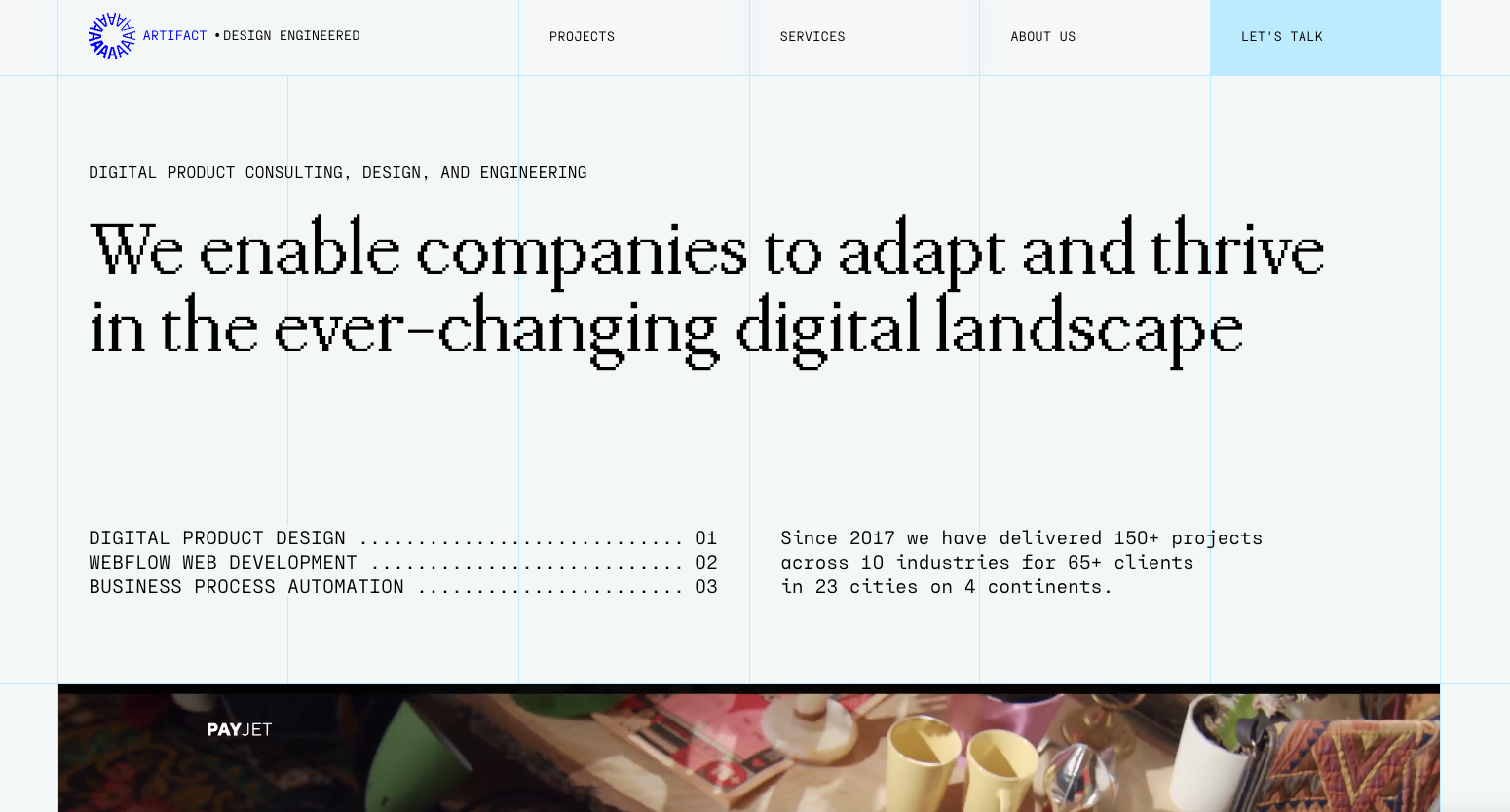
What’s really cool about this design is the use of 90s-style pixelated fonts and the decorative grid. These elements give us a glimpse into the careful planning that goes into creating their sleek designs. It’s like a mix of old-school charm and modern finesse that makes their work stand out.
Glassmorphism: The Transparent Design Trend That Refuses to Fade
Glassmorphism brings transparency, depth, and light back into modern UI. Learn how this “frosted glass” design trend enhances hierarchy, focus, and atmosphere, plus how to implement it in CSS responsibly.


0 Comments