
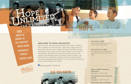
This is really a great website design at first glance. I love the color selection and the navigation design is very striking, very original feeling. The initial impression on this site is a good strong one, and one that can kind of stick in your memory. However as you move away from the homepage it starts to be way to repetitious, I really wish there were different images in the header. The sub pages just feel unnecessarily long to me as well. Overall this site has a great vibe to it, if there was the same level of attention spent on each page it would likely be one of the great ones.


Fitts’s Law: Why the Easy Button Wins
Large, close targets are faster to hit than small, distant ones, that’s Fitts’s Law. A look at the 1954 rule behind buttons, prime and magic pixels, thumb zones, and dark patterns.


0 Comments