
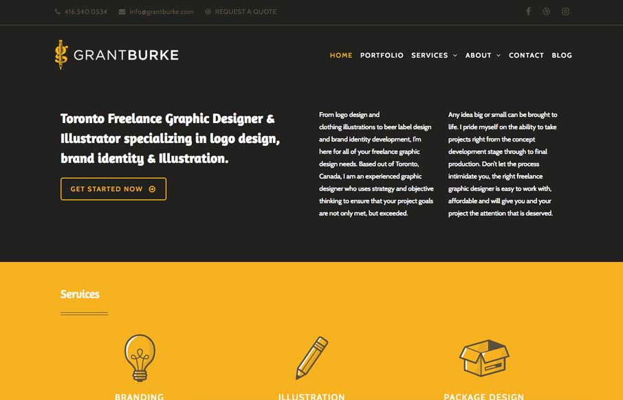
Neat interaction work here for Grant Burke’s website. I like how the header/logo/nav changes around as you scroll. Nifty color choices too. The thing I love most is the multi-column layout for wider screens. You simply don’t see that often and when I see it done well I luurrvvee that sort of stuff.


Fitts’s Law: Why the Easy Button Wins
Large, close targets are faster to hit than small, distant ones, that’s Fitts’s Law. A look at the 1954 rule behind buttons, prime and magic pixels, thumb zones, and dark patterns.


0 Comments