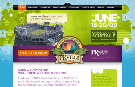
North Florida PRSA wanted to make the annual PRSA conference a fun, casual and educational experience that rivaled the best industry events in the country. The website needed to balance a mix of big city vibe and fun while retaining a sense of intimacy. Bright, vivid colors were used to create the energy and excitement the event promised attendees, while the typeface adds to the hip and modern feel NFPRSA needs to convey. The addition of social networking icons for Twitter and Facebook provide a sense of community and intimacy.
This site packs a visual punch at first, lots of big design elements and loud colors. The navigation is very “web 2.0” feeling as well. It seems like the sub-pages kind of lose interest, this site is ripe for having some more detail, like different treatments on the sub-pages/different sections. Overall the site is a success visually and content wise though.


0 Comments