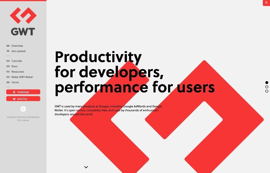
Fairly straightforward design here. Clearly an informative experience, much like a book. The mobile view isn’t that spectacular but it doesn’t really have to be. I like the interaction on the search in the top right a lot.
Glassmorphism: The Transparent Design Trend That Refuses to Fade
Glassmorphism brings transparency, depth, and light back into modern UI. Learn how this “frosted glass” design trend enhances hierarchy, focus, and atmosphere, plus how to implement it in CSS responsibly.


0 Comments