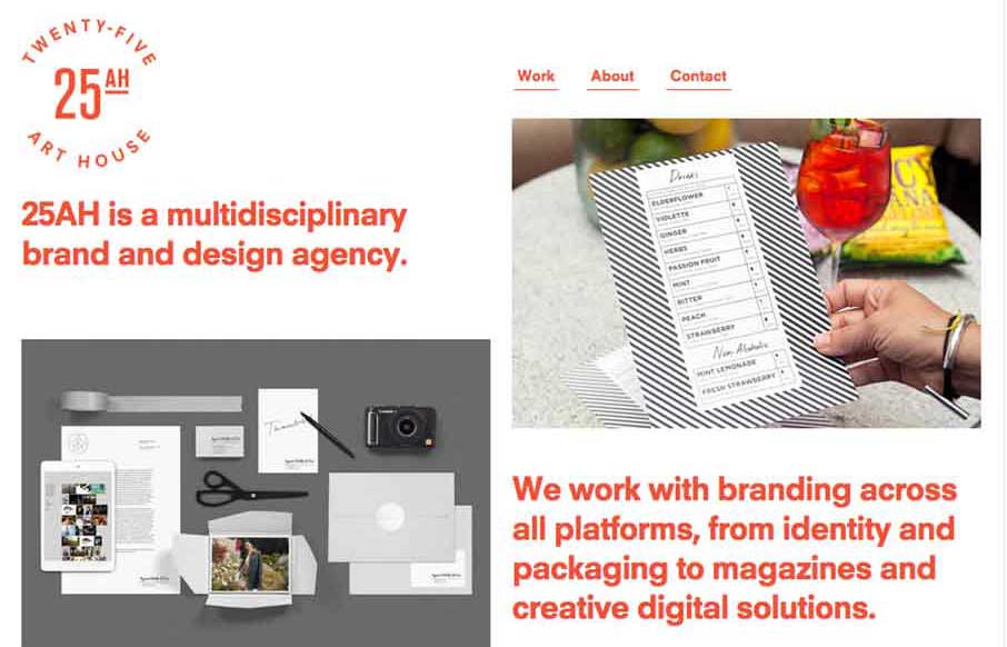
The 25 Art House website has a really cool vibe with the clean and crisp typography and the large notecard looking case study link blocks. I dig the ‘masonry’ loading and sliding around the link blocks do as well on screen resize. Cool site.
Glassmorphism: The Transparent Design Trend That Refuses to Fade
Glassmorphism brings transparency, depth, and light back into modern UI. Learn how this “frosted glass” design trend enhances hierarchy, focus, and atmosphere, plus how to implement it in CSS responsibly.


0 Comments