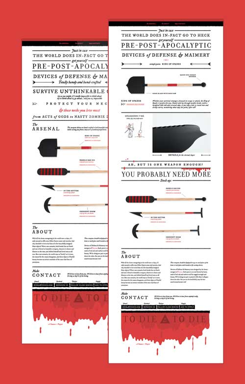
If you don’t like Fuzzco, then you’re probably just jealous you didn’t come up with that first. I’ve read some reviews of their new site – both good and bad – and hey, we all have opinions (insert colloquialism here).
And why am I writing this like an opinion (or insert… you know…), because we see thousands and thousands of websites a year – the majority of them are exactly the same. I have a rant piece I’ve been holding off on publishing that goes into this, but the gist is: “you can do better”.
Fuzzco does better with a seemingly simpler design, and pushes boundaries and tries things that you’re not currently trying. Your agency or your portfolio site should be different than other companies or designers’ sites. You don’t like the continuous infinite scroll – come up with something better. Don’t like the cra cra self-assembler and the multi version pics of the employees in the Who section, come up with something better.
Don’t like the multi-purpose weapons / tools to defend against zombies and aid in continued survival in the Defense & Maimery project (below) – then there may just be something wrong with you…


0 Comments