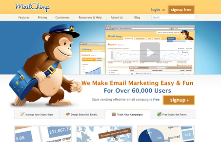
Really tight website from Rocket Science Group the folks behind MailChimp. This design is full of great detail work, top to bottom is a great example of top-notch design work. Their new logo stirred up some comments earlier this year when they unveiled the ‘mighty new chimp’ about illustrations not being logos, etc… Pretty funny situation arose from last years Web Master Jam session in Atlanta as well where the chimp was stolen or something like that.
We reviewed this website in Episode 8 of the unmatchedstyle video podcast.


My problem with this site is that it’s not as good as the chimp icon/logo or the ‘MailChimp’ wordmark/logo thing. The type doesn’t seem consistent, the buttons are big and clunky, and the site retains the main problem from the previous version, is that there are too many options, and the amount of copy once you start digging around is overwhelming. I think I would have a problem with this site if I were coming in as an uninformed user.
Also, their comparison chart leaves off what I would think would be their direct/stiffest competition, Campaign Monitor, so on the one hand they seem honest in comparing themselves to their competitors, but since I know a bit about their competitors, the omission seems too glaring.
Also, where’s the button for the search form?
I think i’ll have to disagree here, I don’t think it’s necessarily overwhelming. I will say that the chimp illustration is a bit large, that might be what’s making it look like too much. Take a look at Basecamp’s website, I think they are just about on the same level of complexity, and are both pretty successful.
Where i’ll agree with you is the search box, I hate it when the submit button is gone. I know all I have to do is click return, but I still hate it.
It’s when you start going to the subpages that it gets overwhelming, that’s more what I was referring to. And the basecamp site is has a consistency that this doesn’t. Why are some things capitalized and some aren’t? Why is the ‘W’ of that main headline so close to the chimp hand? Why does one button say ‘signup’ and the other one is ‘signup free’?
I guess I’m being nitpicky, but it’s just that it’s almost there, if they had the type nailed like the basecamp site does, it would be great.