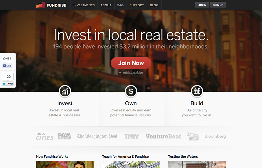
This site is so clean and solid feeling it makes me have trust in the folks behind it before I even know what it is they do. Then I read the text on the site and I kinda still don’t understand it. Now, i’m not really a smart guy so that’s working against me… but it turns out the concept of community funding real estate investments is kinda hard to explain. What they lack in my level of explanatory text they make up in just kicking the socks off your eyes with strong design. It’s all here, a bold graphic look, solid icon design, fixed header and a really well thought out sign up experience. Lovely design work all around on this site indeed.


Glassmorphism: The Transparent Design Trend That Refuses to Fade
Glassmorphism brings transparency, depth, and light back into modern UI. Learn how this “frosted glass” design trend enhances hierarchy, focus, and atmosphere, plus how to implement it in CSS responsibly.


Thanks for the kind words, Gene. We’re actually working on a realignment now that aims to address the lack of explanatory narrative. We’re really glad you like the design though!