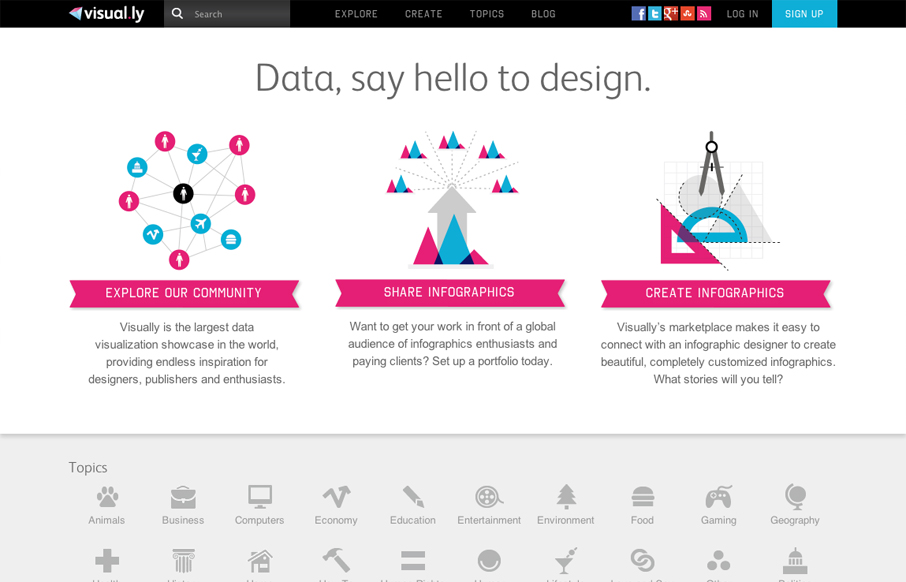
Nice illustrative explanation of how Visually works. It’s fast and effective and pretty bold with the magenta and cyan like colors. Very wide feeling layout, I like that I have room to breath because the site is very dense with info.
Glassmorphism: The Transparent Design Trend That Refuses to Fade
Glassmorphism brings transparency, depth, and light back into modern UI. Learn how this “frosted glass” design trend enhances hierarchy, focus, and atmosphere, plus how to implement it in CSS responsibly.


0 Comments