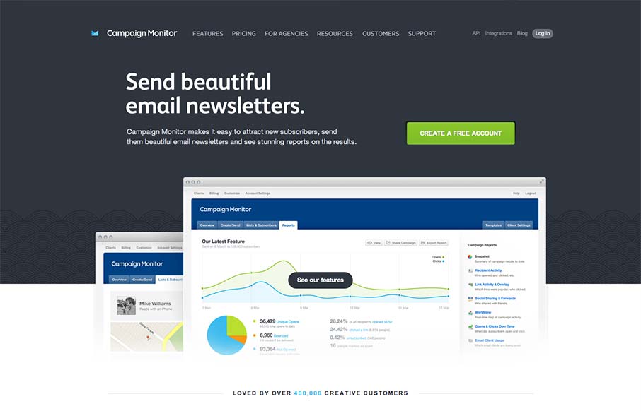
Such a great clean and clear experience. I love the overall simple approach, keeping the visual noise to a minimum, it’s totally different in approach to most product websites like this. The call to action is super clear and concise but doesn’t beat you over the head either. Check out the newsletter signup interaction design in the footer area too, superb.


The Call to Action, Revisited
The Call to Action hasn’t changed in a decade, but the bar has. A fresh look at prominence, copy, mobile tap targets, and accessibility, with lessons from three major design systems.


0 Comments