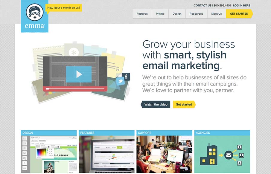
The emma website is very crisp. I dig that top nav and how crisp and brite it looks to me. The “get started” call to action is easy to find and understand and I like that it’s echoed on the page a couple of times. The overall layout gets more dense with content as you move farther down the page but that’s how it should be I think for a product like this.


Glassmorphism: The Transparent Design Trend That Refuses to Fade
Glassmorphism brings transparency, depth, and light back into modern UI. Learn how this “frosted glass” design trend enhances hierarchy, focus, and atmosphere, plus how to implement it in CSS responsibly.


0 Comments