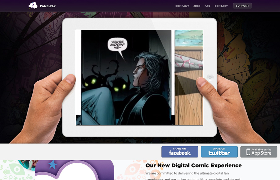
Introducing the new Panelfly Website, this showcases the release of our new app!
Submitted by: Clinton Halpin @clintonhalpin
Role: Designer & Developer
panelfly.com is a lushly colorful site, full of energy and movement. I love the panelfly’s palette; dominantly purple sites tend to look gaudy, but thats not a problem here.
We tend to focus on the homepage for many of the designs that we review for UMS and this site is no different. The homepage video is simple and demonstrates the main functionality of the app really well. Yet another good case of “show, don’t tell” in web design. I especially like the thumb overlay (why does it seem funny to me?) and the mix of .PNG and HTML5 video. The rest of the homepage is basically a list of features with sweet, sweet art… man, do I love comic books. Again, simple and nice.
I definitely like the subpages as well. They show a great deal of variety in the design structure without feeling disjoint. That’s hard to do sometimes and an under-appreciated skill for web designers. The main content for every page could have been structured pretty much the same way. Instead, the designer(s) chose to customize each page to best fit the content, which is stellar! Content is king on information pages and should be treated as such. Kudos.


0 Comments