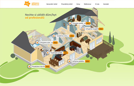
I’m usually off-put by this kind of design but I think buklizenodoma.cz is a really successful implementation of an interactive illustration and info-graphic. The visual separation between the illustrative elements and interactive elements is immediate and recognizable. While the interactive elements are unstructured, the whole design seems pretty crystallographic if you get back from it, they are visually distinct enough to pull forward and away from the artwork. I think a difference in texture could have helped that separation but might have further inflated an illustration that is already over 260kb.
And hey, they’ll clean your house…
in the Czech Republic…
if you’ve got one of those.


0 Comments