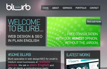
I like the modular-ness of this design. I also kind of like the extreme hierarchy in the text in each box, everything is so big and loud color begins to really drive your eye around the page. The copy almost starts to act as what drives you to scan. I love the background too, and how it supports the blocks of copy with it’s shapes and forms. That said, I’d love to see more subtle hierarchy in the copy blocks, specifically have the headline fonts be bolder than the body font, or switch them around – that may do the trick.
Glassmorphism: The Transparent Design Trend That Refuses to Fade
Glassmorphism brings transparency, depth, and light back into modern UI. Learn how this “frosted glass” design trend enhances hierarchy, focus, and atmosphere, plus how to implement it in CSS responsibly.


0 Comments