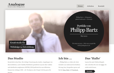
Nice clean lines and I love the circle worked into the design. I’m not wild about that navigation interaction, i’ve seen it on a lot of other sites and it’s never done anything for me. My favorite part of this site is the contact form being placed in the large circle, that’ cool looking.
Glassmorphism: The Transparent Design Trend That Refuses to Fade
Glassmorphism brings transparency, depth, and light back into modern UI. Learn how this “frosted glass” design trend enhances hierarchy, focus, and atmosphere, plus how to implement it in CSS responsibly.


0 Comments