The “call to action” on your website is possibly the most important focus point you should design for. A “call to action” is something on your website that compels or helps a visitor to take an action. It’s not too tricky, it’s all in how you get them to do what you want. In episode 40 of our podcast, we talk through several website examples that utilize the “call to action” in different ways.
The Setup
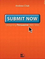 I have written about Andrew Chak’s book Submit Now here before, it’s hands down one of my favorite books on web design. Most of the content in the book isn’t really about graphic design but more about marketing, selling and creating persuasive designs. Even though it was printed in 2003 and some of the examples may be dated, the information in it about calls to action is still highly relevant and useful.
Two things apply to designing a strong call to action from Andrew Chak’s lessons. The first is that you need to “Design for Decisions”. The idea that a web site is about selling is backwards, you’re not selling to people directly, you are in fact helping them to make a decision to buy.
On the web, you don’t sell to people, you help them to buy. – Andrew Chak, Submit Now.
While those may sound like the same thing, it’s a subtle difference. Learn it and you’ll reap the rewards. Just ask 37signals about how important this difference is. Focus on giving your visitors the right amount of information to convince themselves to take action instead of focusing just on the transaction.
The other important concept is to not just think of your visitors in segments based on demographics (sex, occupation, age, interests) as with most user profile exercises. Instead break them down into task based segments. Are they at your website just to look around or do they know what they want and are ready to buy? Thinking through the decision making process and being empathetic to where your visitors mindset is in that process during their session on your website can also lead to higher conversions.
The Websites
HTML5 For Web Designers
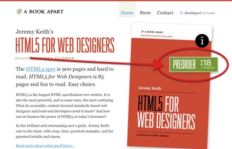
Really well designed and executed website design, the call to action is very clean and clear. The color of the button stands out really well from the rest of the site. The wording on the button “microcopy” is also very informative. “Preorder $18” and having it placed right on top of the image of the book cover gives me all the information I need in order to decide to click the button. Pay attention to how the eye is drawn to the button. The orange of the text leads into the orange of the book, drawing your eye in an arc right to the button.
Joyent
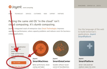
The Joyent.com website is very well designed, clean and concise design. The colors are also minimal with some nice strong orange and brown tones to bring some brightness where it’s needed. The call to action on this site for us is the small(ish) orange button, that’s labeled “try it now”. Even though it’s small, the placement and coloring is very effective in drawing your eye straight to it. However, the microcopy on this button isn’t exactly the right choice for the action taken. We think the main call to action should be more along the lines of the link below that says ‘View the Details’, since the commitment of actually trying a service like Joyent seems fairly large.
Basecamp
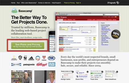
The Basecamp and the Highrise websites created by 37signals are really great examples of successful call to action design. The main button here stands out from the rest of the elements very cleanly and has excellent microcopy. “See Plans and Pricing” is a perfect next step for their visitors, they realized through some extensive A/B testing that their visitors weren’t ready to buy just yet off the home page. Their visitors wanted to continue shopping and needed a compelling call to action that spoke directly to their desire to learn more.
Forrst
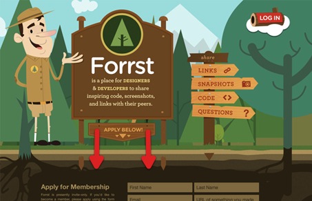
The Forrst site is a slightly different spin on the normal call to action you’ll see in the wild. For Forrst the thing they want you to do is apply for membership. They’ve designed a fairly simple home page, they placed the application form right on the page. But they’ve worked in a clever button space that makes the page scroll down to view the full form. The microcopy on the button is effective and informative, leaving no confusion as to what it going to happen.
Visual Notion
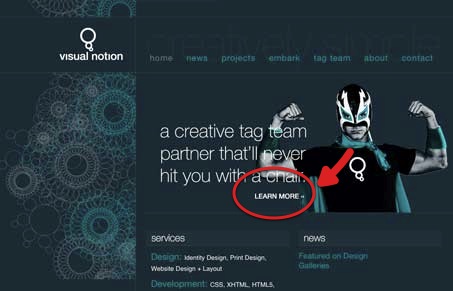
Not all calls to action need to be large buttons or set in complimentary color schemes. Sometimes they are just simple little links that propel you further into the content of a website. With Visual Notion, the call to action is only the “learn more” link under the main heading copy. Positioned next to that really visually interesting photo this call to action really stands out.
Sparkfire
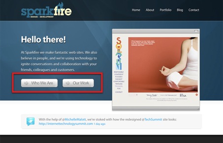
Sparkfire’s the call to action is a bit confusing. When you’re designing your call to action you need to decide on the most important next step for your visitor to take then play that up. This design has a divergent set of calls to action, they work effectively as navigation elements just as the top horizontal navigation does, but not as elements that stand out uniquely from the rest of the page’s navigation.
Dan Scotton
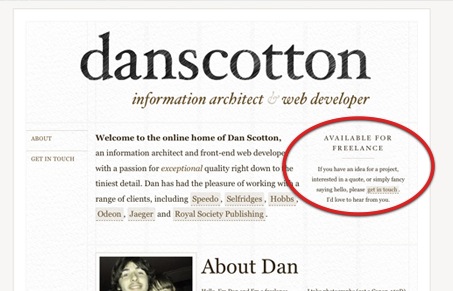
This website has a nice “soft sell” call to action. It’s almost opposite programming type of design where he’s going against the normal bravado and excited nature of most website portfolios. The “I’m available” attitude of the call to action link is refreshing to see. It’s amazing how it’s just as strong as a large orange button on this website design too.
Add This
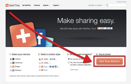
The Add This website is very minimal and clean. The call to action is front and center and it’s interesting to see that it’s part of a setup form. This design has a nice arc to where it draws your eye down to the call to action, the “get your button” button. It’s that top left to bottom right movement/diagonal that can make the conversions if you can work it in.
Strutta
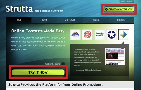
Strutta is employing two buttons that are very similar and that have different microcopy. “Create a contest now” and “try it now” are misleading, the visitor is actually taken to a pricing and plans page and can’t try it without signing up. Some lessons learned from 37signals here tells us that the visitor would be better served, and conversions possibly raised, by making that microcopy properly reflect what the visitor will actually be shown.
That’s the “call to action” and some great and almost great examples of this concept in practice. We sincerely hope it can help you get more conversions where you want them.



Update:
According to @bnyquist, who pointed this out to us.
“@unmatchedstyle – Ha.. looks like Joyent took your advice and changed “Try It Now” to “See Pricing”.. nice video by the way.”
Might be circumstantial, but it would be awesome to hear form someone at Joyent to see if we had any impact there and what they thought.
Great video, lots of tips and help that apply to more than just calls to action.
I don’t quite agree with the “Visual Notion” example. For me personally, the call to action was one of the last things I noticed on the page – even though the main heading copy was the second (after the logo).
I find that area of the page cluttered thanks to the thin text over the high contrast arm. Also, the main heading copy appears to me as a quote, with “learn more” as the quotee. So I totally skipped it in the first instance, and later was not intrigued to learn more as to why they would not hit me with a chair.
Does that make sense or am I being too harsh? I do love the graphics of the logo and background.
That’s the thing about the psychology of getting people to look where you want them to look. What’s totally obvious to one person may be totally hidden to somebody else, so it’s a challenge to design something obvious while trying to retain some amount of subtlety.