This interview is with Ethan Marcotte (@Beep) who was at InControl Orlando speaking about Responsive Web Design.
I asked Ethan how he came up with calling it Responsive Web Design and his approach to it. He’s a humble man so he immediately credits others with influencing him. Given that we now have tools like media queries and flexible grid layouts at our disposal this is a natural progression in creating designs that work to self correct themselves for different screen sizes. Now that we all have “the internet in our pants” as web designers we’re being forced to make decisions on creating a stand alone mobile website or utilizing RWD or nothing at all. This approach Ethan is discussing is a very compelling solution to many web design scenarios.
We briefly discussed Any Clarke’s post where he says “I don’t care about Responsive Web Design”. Ethan agrees, I do too. But I do still care about RWD and helping to foster it’s overall acceptance and practice within our community of web designers. I’m glad they’re all excited and talking about it too.
Which Approach
Looking at how to choose RWD over a stand alone mobile site isn’t clear cut. If you already have a strong presence with a site on the “desktop web” then maybe a mobile site is the way for you or your client. Ethan’s approach is to look at how your users are accessing the website comparing that to your goals and examining where the overlap is. Often this will help you nail down the best approach.
A Book Apart: Responsive Web Design
In our interview his book wasn’t out yet, but it’s out now. I just ordered a couple copies for myself (we’re also giving away a copy to our readers!) I’ve been following Ethan’s RWD writings and discussions, it’s come a really long way since the original ALA article (from May 2010). Also I heartily agree with Roger Johansson’s review!
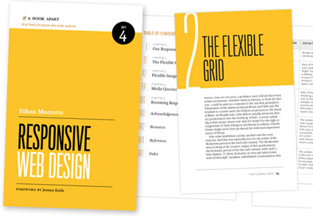
Here are Ethan’s own words about the book from his blog:
It’s a crash course in how you can apply fluid grids, flexible images, and media queries to your own work, but let’s face it: design is so much more than those three ingredients. As a result, I’ve tried to share a few stories I’ve picked up from working on real, live responsive projects: the lessons I’ve learned, the questions that have been raised, the hard choices made.
You can read an excerpt (Chapter 3) on A List Apart right now.
Ethan Marcotte
Ethan Marcotte is an independent designer/developer who is passionate about beautiful design, elegant code, and the intersection of the two. Over the years, his clientele has included New York Magazine, Stanford University, and the World Wide Web Consortium. Ethan swears profusely on Twitter, and would like to be an unstoppable robot ninja when he grows up. Beep.
The Giveaway!
Leave us a comment about how you’ve used Responsive Web Design on a recent project, or plan to and we’ll randomly choose one of you to get a free copy of Ethan’s book in a couple of weeks.


I made an insights dashboard a little while back with media queries to support different body widths, which were multiples of the base widget width unit. I thought it was pretty neat.
The first time I heard about the media query strategy was at a presentation of jQuery Mobile by the creators at @Bocoup in Boston. The basis around fluidity across devices was exciting and daunted.
Still excited and daunted.
I’ve only used media queries now a handful of times on projects and will be soon embarking on a more ambitious app for a client that needs to offer the same functionality across devices. It seems to be a good route.
Now sign me up for that book:)
Hi, I have just played with media queries, just as I read about it on AListApart months ago, like I am doing now with Fluid Images after the current AListApart article. However, I am to convert my current mobile app’s web site to the one responsive to screen sizes.
See, I am quite honest 🙂
“We’ve got the internet in our pants now!”
?????
Dang… Those were supposed to be 5 stars instead of question marks. I want to try again!
★★★★★
I am currently working on my website right now, dbanksdesign.com, and have been building it using responsive design. Now my blog reads well on mobile, tablet, and desktop
I have to get this book!
RWD is the future, this book is a must-to-read
Awesome interview…
????? ? (stole this from trent’s comment)
Oh shoots! =/ the start didn’t come out.
I’m planning on implementing responsive design in one of my next projects. I’m working on moving right on into that way of design and development.
Can’t wait to get my grubby mitts on this book, it looks ace!
Responsive Design is definitely the way good designers make web sites, and hopefully become the default. I also like that we (web designers) will now have a very tangible artifact to show those unfamiliar with our craft what make web design different from other medias.
recently i found nearbytweets.com a cool tool that’s not responsive but which would benefit GREATLY from being useful on a phone or other mobile device.
because it has an inner scrolling div for the tweets (and mobile doesn’t allow them to scroll as of now) more than few tweets aren’t visible.
brian cray, the creator had talked about the importance of social developers, so i figured i’d try to hack up a css and JS that would complement his site, and make it ready for a phone. i gave him a snippet of JS to run in his console to load up the new styles.
here’s the quick writeup for him to add his @media goodness:
http://jonahgoldstein.com/poof/nearbytweets/
Just wanted to announce that Jonah Goldstein is the winner of this book give away of the A Book Apart Responsive Web Design by Ethan Marcotte.
Congrats Jonah! Book is in the mail now.
Truely brilliiant, read twice now and learned so much. The defining web design book of 2011 without doubt.