I asked Jan Kovarik (@jankovarik) creator of Glyphicons how and why he would want to make something like these icons.
The note on his website about it is as follows:
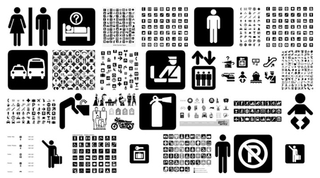
It seems almost impossible to overcome the symbols created by AIGA or Apple. However, I would like to follow up on their work and create a more modern and constantly evolving package of symbols which will have wide range of applications not only on monitor screen.
I wanted him to expand on that for me and so he wrote back this post to share with us here at UnmatchedStyle. I hope you’ll read it and pay his website a visit, I particularly happen to love Glyphicons.
From Jan
During my studies I have admired the beauty of shapes of various symbols. We are surrounded by these symbols and they simplify our orientation, not only in the virtual world, but also in the physical world around us. Sometimes we perceive them, but we still take them for granted.
What has always fascinated me is the fact that these symbols always appear to be so simple at first glance. Thanks to my years of experience as a DTP within an advertising agency, I am able to grasp the power behind these symbols. I have been working in this area for almost 8 years and yet I feel that I am only just now starting to learn how to design them. I have also been lucky enough to have the good fortune to work with the various icons and symbols from a number of lesser or better known designers.

[Resource: Aiga symbols]
One day I woke up and realized that if I do not want to spend the rest of my life working on editing and bending various existing icons, I have to start creating on my own.
Recently I have found out what difficulties are hidden behind the creation of these symbols. The biggest surprise was the amount of research and information needed in order to create even the most basic icons. This means, the final shape of the symbol has to go with not only its appearance but it is also important to consider the information and direction given to its end users.
With this in mind, all symbols must be clear to understand for everybody regardless of age, origin or gender. Maybe it sounds like a piece of cake, but the “recipe” is more complex than you think. It is a mixture of factors that you need to consider in the “cooking stage” of an icon.

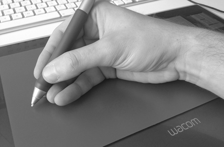
Due to this, I make sure to devote equal time to preparation as well as in their creation. My design process follows these steps: gather information, search for existing symbols and see how they are looked upon and registered by people and then I decide if there is room for improvement. If my answer is a strong Yes! then I knuckle down to work with a pencil or a tablet pen in hand.
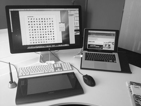
The execution involves a pencil, a sheet of paper and finally 2 monitors. On the first monitor I have shapes and options, which I play with. On the second one I look at images and materials, which feed me with ideas on the subject matter. Of course “first time luck” is rare, so it involves a lot of consideration to the above-mentioned variables and research, which usually puts me on the right path to success.
I had originally planned to use the icons I create purely for my own projects, but when their numbers grew, I decided to offer them to other designers. I believe that somewhere out there are people who are looking for the same simplicity and consistency as I am, so I hope Glyphicons help them in their daily work, as they help me every day.

Nothing in the world is perfect to me. I am one of those people who is almost never completely satisfied with my work, except for very brief moments when I can step back for a second. It is a “curse” and a big advantage for me at the same time. Curse because the feeling of a well-done work lasts only a very short time. The big advantage is in my need to improve the work on my icons continually – so hopefully I get better at it.
About: Jan Kovarik
 Jan Kovarik (@jankovarik) is a freelance graphic and web designer from the Czech Republic. He’s created a bunch of websites and other design materials throughout his career, but most importantly he is the creator of GLYPHICONS which is a library of precisely prepared monochromatic icons and symbols, created with an emphasis on simplicity and easy orientation.


I like the simplicity in the end product. And its importance where the icon glyphs created are to visually communicate and be a functional part of the design.
I applaud your efforts and sharing with me your inspiration. I’ve been looking at creating some glyph icon sets myself.
I was wondering if you could post larger image of macbook pro + Apple Cinema Display. Its insanely sexy….
And by the way, excellent job
I don’t know how Bootstrap is using those but judging by your Glyphicons website, these really should be in SVG format. When scaling on touch devices that pinch and zoom they look pixelated with jagged edges.
Good job Jan Kovarik !
I know you from Twitter Bootstap 😀
there is no add icon .. that has always bothered me.. anyways you rock. I use your icons on a lot of projects
good job bro