I’ve been in love with type for as long as I can remember. Even before I really knew anything about typography. So last week, I achived a long time goal and released a commericial typeface for sale on MyFonts.com.
As type design tools have become more affordable and accessible in the last few years, many designers are expressing interest in creating their own typefaces. So if you are interested in developing your own typefaces, here are a couple of tips to get you started.
What’s the plan
You have to make a lot of decisions early in the development process. Is your typeface a serif or sans serif design? What do your decenders and ascenders look like? How tall is your x-height?
The further you get in the design process, the more difficult it becomes to make changes and alterations so it’s important to work out your design details early as possible.
Choose your weapon
To build my typeface, I choose Glyphs, a powerful, user-friendly app. Glyphs is $299 Mac-only and is available direct from the developer or through the Mac App Store. I’d recommend purchasing direct from the developer since there tends to be a delay getting the most recent updates through Apple.
With Glyphs, you can build a robust typeface with complete character sets and advanced OpenType features. Plus, Glyphs makes it easy to use Multiple Masters to interpolate a range of weights easily.
Glyphs isn’t the only option for building your font. The same developer offers Glyphs Mini, a $44.99 version without some of the professional features. RoboFont is a very powerful €400 professional package that many of the large, established foundries are using. And Fontlab offers three different apps with varying feature sets for Mac and PC — Fontlab, Fontographer and TypeTool. They all have their own quirks and learning curves so choose the one that works best for you and has the features you need.
Just 26 letters, right?
So how many glyphs do you need to include in your font. There are just 26 letters in the English language, right? But including uppercase and lowercase, numbers and punctuation, the number of characters balloons. And not everyone speaks English, so you need to include foreign language characters. For many of these characters, you need to research what they should look like.
Depending on the design of your typeface, OpenType allows you to add features like small caps, symbols and stylistic alternatives. That only adds to the gylph count.
By the time I was finished, each one of my typefaces included 430 glyphs. Powerlane has 20 different fonts for a total of 8,600 characters.
It ends up being much more time consuming than you realize to create and refine the characters. The upper and lower case are only the beginning…
Spacing is tough
Drawing the glyphs is only one part of the process. The more time consuming element is spacing and kerning.
The spacing of the characters is crucial. How tight should the letters be spaced? How do I compensate for the different character designs. You set the basic spacing by adjusting the right and left sidebearings — essentially setting the white space around the character.
Once the sidebearings are set, then you need to set up your kerning. Not just obvious english language pairings but also common foreign language combos as well. And if you include small caps in your design, you’ve got to kern those as well.
Testing, testing, testing
After you’ve built your typeface, it’s time to start testing. Checking spacing and kerning. Making sure your OpenType features work as expected. Testing your font in different apps and systems.
It can be time consuming and involves a lot of trial and error. A lot of small tweaks and exporting to confirm.
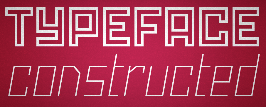
About Powerlane
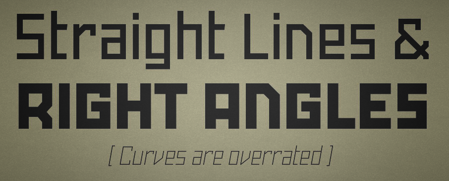
The end result of all this work is Powerlane. It seems most of the new typefaces on the market today are either humanist sans-serifs or “hand-drawn.” Many of them are very cool — and popular — but I wanted something different with my first commercial typeface.
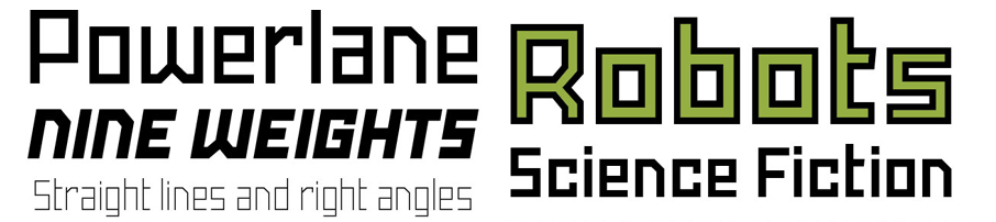
Powerlane is inspired by 1920’s Russian Constructivist posters. All straight lines. No curves. I wanted my first commercial font to have a full range of features. So Powerlane has 9 weights from thin to extra black, regular and oblique versions, an outline variation, small caps and a couple of alternate character designs.
For Unmatched Style readers, comment below with the name of your favorite typeface to be entered in a drawing for Powerlane Complete and a limited edition typeface specimen book. We’ll pick a winner randomly from the entries after a couple weeks from this today’s post date.


Count me in please. My favorite typeface at the moment is Alegreya, by Juan Pablo del Peral.