
Mobile devices are continuing to enjoy meteoric growth, and native apps are struggling to keep up with thousands of different screen sizes, orientations and operating systems. This has resulted in dozens of code bases that all need to be updated and tweaked every time a new device is released or a new OS is introduced.
Many people are attempting to bridge this gap — from in-depth GUIs to device-specific code bases — but no one has created a way to easily showcase a fully-responsive, single-page web app until now.
Foundation for Apps enables designers and developers to easily create multi-view web apps that look and feel like native apps and provide a seamless experience across all devices.
Foundation for Apps not only bridges multiple devices but team members. Designers will love writing apps in the HTML and CSS they already know and devs will love getting an in-depth prototype instead of just an annotated PSD. This enhanced cooperation leads to better and more complete products and protoypes that can be finished in a fraction of the time.
Foundation for Sites has helped millions of designers and developers build cutting edge websites and Foundation for Apps will help them build the next generation of immersive web apps.
New features in Foundation for Apps
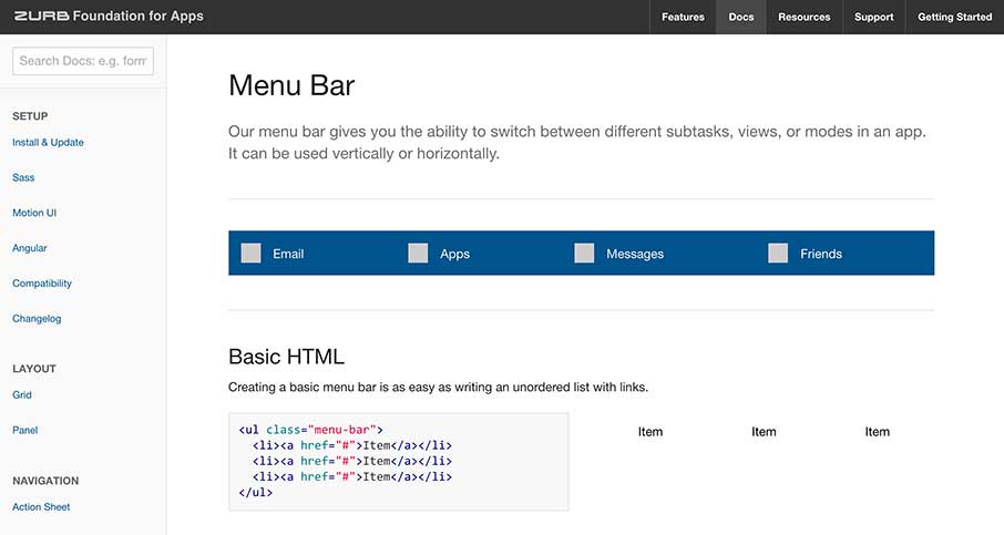
The Grid: A new, flexible grid designed for any and every device.
- Vertical Grid- Use the power of Flexbox to carve the screen into vertical sections and never rely on unreliable fixed position headers again.
- Independent Scrolling Sections – Create independently scrolling sections that can be inline on desktop and off canvas on mobile devices.
- Easier Source Ordering – Order divs on desktop, tablet and mobile in entirely different order, all with simple ordering classes.
Related article:
http://zurb.com/article/1333/foundation-a-new-grid
Motion UI: A robust, easy to use motion and transition library to help you create an experience that really feels like an app.
- Animation Classes – Create simple angular prototypes and apps, without ever writing a line of Angular Code. Name your view and your url and we create your angular routes, so you don’t have to.
- Motion Modifiers – Change the stock animations with modifier classes. Affect the speed, ease and delay, all with classes.
- Sass Mixins – Easy to use Sass mixins, so you can create custom animations without the need to remember the complexities of keyframes.
Related article:
http://zurb.com/article/1340/foundation-for-apps-motion-ui-is-the-new-
Stateful Prototyping and Building – Developers and non-developers can now harness the power of Angular JS to create complex web apps.
- Templatizing Angular – Create simple angular prototypes and apps, without ever writing a line of Angular Code. Name your view and your url and we create your angular routes, so you don’t have to.
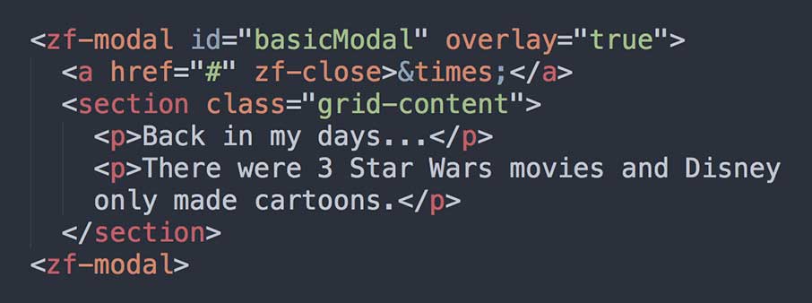
- Component Driven – Call our JS and CSS components with simple custom HTML tags. No need to remember to call a div, a ul or a dl, just zf- and the name of your component.
- Add Motion to Views – Show your users when content changes by adding enter and exit motion classes to views. Simply define one of our predefined Motion UI classes at the top of your view and you’re done.
Related article:
http://zurb.com/article/1345/design-amazing-single-page-apps-with-the-
Key ideas core to the Foundation for Apps framework
- Single Page Web Apps: Built to make single page page web apps even if you don’t know how to write AngularJS.
- Flexible Components: Components that can be displayed differently on different screen sizes, making sure to maximize for the device you’re on.
- Responsive- Foundation was the first responsive framework, and it permeates every aspect of the framework.
- Build for every device with ease.
- Rapid prototyping- Dozens of elements and styles to help you go from coded prototype to polished product.
- Semantic- Foundation can be used with completely semantic markup. Write clean code without sacrificing any utility or convenience.
- Mobile-first- Foundation’s code is built with small devices as a priority, and goes up from there. Like Foundation for Sites the media-queries are built for mobile devices first and expand as devices get larger.
- Sass- The premier CSS preprocessor is at the heart of Foundation.
- Customizable- Foundation was built to be easily re-styled with tons of Sass variables available for change.
- Readable- Foundation is written with humans in mind, and is easy to read even if you don’t know much code.


0 Comments