Every year for ConvergeSE, our web conference in lovely Columbia, SC, I try to create a new theme and some artwork for our attendees to enjoy. This year we decided to choose Spirit Animals for each of the conference tracks. Design, Development, Front-End, Business/Marketing, Gaming, Maker, and UX all have their own animal representative. To further differentiate the Spirit Animals, each was assigned an element, e.g. fire, water, wind, etc. that informed the palette of colors used in each poster. This is a mostly visual guide; I just wanted to show you guys a few of the tips I learned while working on my first poster series.
I’m well pleased with the final art and I learned quite a bit about digital painting for poster design that I thought would be worth sharing.
*Before I get started, a note about Illustrator. Many of you may be wondering why I didn’t use Illustrator for this project. The answer is simple. I tried Illustrator first and couldn’t reproduce the line quality that I wanted. Photoshop’s brush engine is much more suited to my style and the desired look.
Setting up Photoshop
I first learned that screen printing is a binary process. It cannot produce true gradients, instead relying on dithering to create the illusion of a gradient. Dithering is essentially the process of printing many closely placed dots that fade out to create the “gradient” of color.

The top image is a dithered gradient with only black and white pixels to simulate the transition from one value to another. The bottom image is a smooth gradient with dozens of different grays between white and black. Screen printing can only do the top version.
I decided early on that I didn’t want gradients of any kind, preferring very clean lines and color separations over soft transitions. I wanted to embrace the layered printing process. To achieve this cleanly, and to keep the printer from pulling his hair out trying to produce my separations, I tweaked my normal Photoshop painting setup to give me the types of lines I wanted and none of the transparencies that the printer didn’t want.
My Brush
I have a custom brush that works really well if I want to reproduce the look of a synthetic acrylic round brush. I wanted the line quality that this particular brush produces, but needed to instead use it as a pencil. The pencil tool functions more or less the same way as the brush tool in Photoshop, but lacks transparency. It either paints pixels at 100% or not at all.

Both strokes use the same brush settings. The one on the left is the Brush Tool and the one on the right is the Pencil Tool.
My Eraser
I set my eraser tool to the same brush and then set it to pencil mode so that it functions exactly like my brush. This ensure that any clean up I do with the eraser tool will have the exact character and features of the brush strokes themselves.
The Marquee and Lasso Tools

With the marquee or lasso tool selected, uncheck the “Anti-alias” box.
The only setup necessary with these tools is to turn off anti-aliasing. I often use these tools to mask off small areas or to select unwanted lines and delete them. Sometimes, I use these tools to “carve” the artwork and draw in a subtractive way. By turning off anti-aliasing, I ensure that these tools won’t leave any unwanted artifacts in the final artwork.
Creating The Artwork
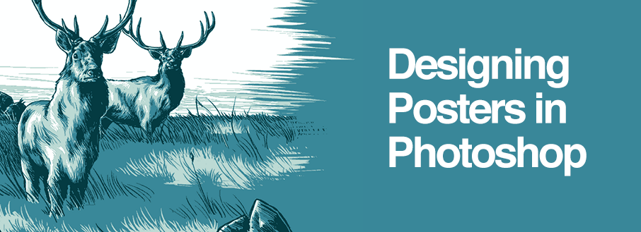
I don’t want to bore you with the full set of 7 prints, but I do want to show the process for creating at least one. We are going to look at the Stag print. It’s probably my favorite, so hope you enjoy. This particular print only has three colors, though some of the other prints have as many as 5. I just thought I’d keep it simple.

The Stag poster.
I try to keep my process as simple as possible when creating digital art. For the prints, I wanted to embrace the medium and work in solid, flat layers. One color per Photoshop layer seemed reasonable to me.

Interested in seeing these posters live.. well, in person? Join us at ConvergeSE in Columbia,SC, April 15-18, 2015, for a unique look at the web design industry and community.

Colors
To ensure that my artwork has a clean range of values I drew all the posters in grayscale and then colored each layer with a color overlay layer style. Just set the layer style to “overlay” and it will retain the same value as the gray, but be colored. This makes tweaking the colors and values really easy and helps to ensure the print has a nice spread of values.

Each square is really just a different shade of gray, but they all have a color overlay applied to them with it’s blend mode also set to overlay. Instant color!
Sketching
I started each poster with rough line sketches on a transparent layer. I used the same brush for sketching as I did for the color work, but at a much smaller size and set to a light grey. Many folks get hung up on this part because they believe that they cannot draw and therefore don’t have the skill to create a nifty poster. To that I say pish-posh. There are a hundred ways to skin a cat. This part is all about skill and/or patience. If you don’t have skill, just be patient… and trace stuff!

I try to sketch everything freehand from reference, but if you aren’t great with a brush then you can always trace your source images or composite them in Photoshop and draw on top of them. Just make certain you have the rights to use your source images if you are going to trace them.
Key Lines
Once I’ve created the rough sketch, I try to focus on the principle line-work for the piece. This was a completely stylistic consideration. Were I going for a different look, I might have focused on a different color first.

Key Lines are usually the darkest color and almost always outline the main objects of the design. They are basically the dark outlines around stuff in your drawing and they unify all of the flat color fields into an easily recognizable image.
To build the values, I drew in all the lines, more or less the way that comic book inkers work. Then, I used the bucket tool to quickly fill big flat areas. Some of the posters had fewer large fill areas than others, but this basic approached worked for all the images.
Shadows

After the line-work was done, I added in one or two values of shadow. Shadows are fairly easy if you aren’t going for a hyper realistic image. In flat color drawings, picking a light source and dropping in shadows on the opposite side of an object usually suffices.
Highlights

Highlights are much the same as shadows, just on the opposite side of the object. These details can get very complicated depending on the effect that you are trying to achieve. For instance, if you want to make an object look reflective or metallic, the highlights should be very bright and have a hard edge. If the object needs to look soft or matte, then the highlights should be dim or nonexistent. Coupled with the right shadows, highlights can simulate any material or lighting situation.
Choosing Colors
Every poster has it’s own palette, based on an animal and an element. At this point, I apply color overlay styles to each layer and start to tweak the colors a bit. I’ve found that for a more natural lighting scenario, the highlights should be slightly warmer colors and the shadows should be slightly cooler colors. Obviously, go nuts and try whatever works for you, but natural light is fairly predictable and easily simulated.
In Closing
After getting all of my layers in order, I shipped it off to the printers and they matched my colors to Pantone Colors. They are creating separations and we’re picking papers for all the different animals. Now it’s all in the hands of the printing gods!
Have fun and remember that digital drawing is incredibly forgiving. I hit the undo button about 10,000 times a day. Its just pixels on a screen and its impossible to make a mistake. If you have any screen printing projects coming up, I hope this little walk through my process was helpful.


Amazing blog piece. You have shows extra ordinary creativity. One must share this blog piece.