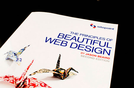
Giovanni DiFeterici: Hey, this is Giovanni and Gene with Unmatched Style and we’re here to talk about the second edition of Jason Beaird’s book, “The Principles of Beautiful Web Design” which is available from Sitepoint.com.Before we get started we just wanted to say that we were going to give away a copy of this book. All you have to do is leave a comment along with this post. Tell us some of your strengths and weaknesses in regards to the things he talks about which are typography, color, texture, layout, and composition.
Gene Crawford: Layout and composition. Yeah, so leave those in the post and we’ll get you a book. We’ll randomly pick from someone.
Giovanni: That’s right, we will randomly pick.
Gene: So, on to the book. What’d you think of the book, first off?
Giovanni: I think it’s a good update, I do. I’ve read his first. Pretty much, when I was getting into design, I read his first book. It was kind of an introduction to applying a lot of the things I learned in fine art to the web. It was a great book for me. I think that this is a really good update. It brings a lot of the new, more current technologies into the fold.
Gene: In case you’re not really familiar with the first edition, “The Principles of Beautiful Web Design, ” this is Jason Beaird’s book. He takes you through, I say the four pillars of good design. Like you said, layout and composition, color, texture, and then typography. It just takes you through that.
Giovanni: He structures it almost the way a school does where he starts with the elements and principles of design in general as they apply to all design and not just to the web. It lays out the groundwork for understanding those things just as applied to anything. Then he moves slowly into web design and how does things apply on the web in regard to the restrictions and freedoms of that kind of interactive media.
Gene: I think he said he actually, originally intended the book for developers who didn’t know how to design, which is kind of interesting.
Giovanni: Yeah, and it’s cool.
Gene: That you’d write a design book for someone who doesn’t know how to design. In the end, we both teach class. We both teach web design and stuff like that, 101 and 201. I know I use his first edition in my class because it’s so good. Some of the updates that he put into the second edition, he gets into some trendy updated stuff. I think the first edition was two or three years ago.
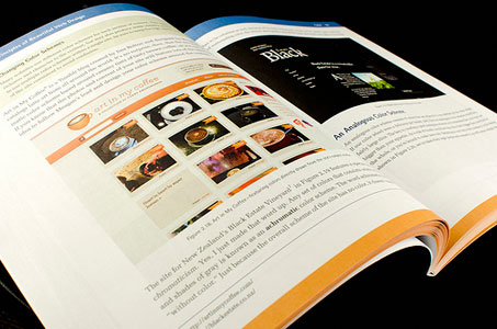
He gets into some things. He introduces you to the 960 grid system and some of the things that hit web design like editorial, pages design where you design each post of a blog post differently, and that kind of thing. Big footers and stuff like that. He explains where that comes from and what it’s all about.
Giovanni: Yeah, he does get pretty granular about half way through the book, I’d say. Before that in the first half, I think that the fact he focuses on just things in general, the principles and stuff. It gives the book a timeless quality.
Gene: It does.
Giovanni: It’s fundamental, but then slowly moves into more discreet and specific things.
Gene: Specific subjects.
Giovanni: It’s really good for that. He leads you into the specifics of web design.
Gene: That’s right. Like when he gets into typography, he really digs into that. That’s pretty specific.
Giovanni: It’s one of the four core tenets of really good design you’ve got to know how to use typography and stuff. He sums the book up with the little extras and give-me’s like telling you about how to work with an illustrator, look for stock photography, and that sort of stuff. The one thing that’s really cool is that he updated was he used a real world scenario, case study throughout the book. He used the website for Southern Savers which we’ll make sure and link it up.
If you haven’t checked that site out, it’s really a beautiful site. It took the first version of that site which was really not that good of a site to visualize, to a really well-done design website.
Gene: Yeah, it’s a nice site and he really breaks it down. He obviously had direct access to a lot of the concept materials, clearly, and shows those in the book. It’s a really good process and it’s very visible and easy to understand. It’s nice to get the theory and then see implementation of theory. If you’re somebody just starting out in design, it’s a really great book. If you’re someone who doesn’t know anything about design, hopefully one of your designer friends will give you this book. If you’re a student, it would be a really great book.
Giovanni: It’s also good for just designers in general who want to get up to speed. Maybe they’ve been doing the same thing for awhile and they want to really get up-do-date with the most contemporary methods.
Gene: Yeah, I was going to say, for me, it was really great as just a refresher. It’s not a thick book, it’s thin. You can throw it in your backpack and just break it out whenever you need to reference some stuff. It’s really perfect for that.
Giovanni: Jason has a really conversational tone, so it’s really easy to ready.
Gene: Absolutely.
Giovanni: It’s got a lot going for it.
Gene: So, we both like it?
Giovanni: I did like it, yes, and do. [laughs]
Gene: All right, thank you.
Don’t Forget! We’re giving a way a copy of the book with this post! Just leave a comment to be entered to win, we’ll randomly pick a winner from the list of participants. Leave a comment about what your greatest strength or weakness is when it comes to design: typography, color, texture, layout & composition.


To pick from the list I’d say my greatest weakness in web design is composition/content. there have been times when i have looked at every page this website (Unmatched Style)has posted. Yeah, ALL OF THEM; just to see, “what really makes a home page? What sort of info is everyone else putting up? What makes my project so different and how does that apply to what goes where.” I’m a good organizer, but when somebody says “I want a website…GO.” Theres either a lot, a little, or not enough to do with that. I feed off of seeing how others solve this problem. It’s the theory, the “Why?” that I’m looking for, after that I can do the rest. I usually get that out of awesome books…. Especially ones with little origami cranes on the front that Unmatched style gives away.
My greatest strengths are in typography and color; the former thanks to a great first job out of design school at a tiny studio whose principles were so committed to good typography they created their own custom kerning tables for every font they used.
I struggle typography in my designs. I guess I come from the old times before typekit and fontsquirrel when we had just ~10 fonts. Most of the sites I design are large CMS sites where the clients need to update the content often and using graphics for headings just aren’t really an option. Now with all of the possibilities I find myself overwhelmed with the vast selection of fonts at my disposal.
I still have my well thumbed copy of the first edition and loved the way Jason explained everything in terms that could be easily understood by the “self taught” like myself.
I am really looking forward to getting to grips with CSS3 and HTML5 and hope the second edition covers these developments in the same manner.
Also love the way the origami birds on the cover have evolved stunning plumage!!
This is a great read for beginners in the web world, and a great reference for professionals. My strengths lie moreso in front-end coding, so a book like this is perfect for me. Jason explains not only what works in design, but WHY it works.
I’m still don’t know how to choose the right font 🙁
I think my greatest weakness is in terms of layout – trying to break the mold and do something different with a layout so that it’s not like 99% of the other sites out there.
This looks cool. Thanks for the review.
Some of the biggest problems I personally have with Typography is just getting the typography across in the web format. I mean, I’m usually left relying on creating an image instead of really using the full font library that I have on my machine with most of the magazine work I normally do.
Another problem, for my own personal work, is ultimately deciding on a design that reflects me. It might be easier to convey designs for others but when I’m trying to encompass Myself in any medium, the design takes way too long to be decided upon.
Sorry about the dual submissions. I was putting this into the text box under it but I accidentally submitted too early and I don’t see an option to edit.
Strength in modesty, and in designing things that look good.
Announcing the winner of the Principles of Beautiful Web Design book. It is Chris Raymond/@imdesigntank. Congrats & thanks for posting!