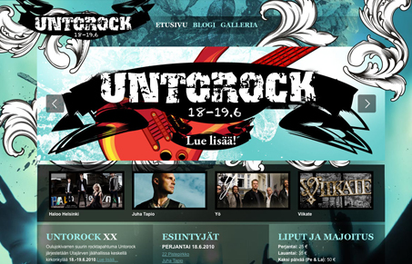
I like the illustrative quality to this design, the flourishes and how they interact with the foreground and background looks great. I also like the overall vibe to this design, it just feels interesting. Though, some of the content is hard to take in visually (no I can’t read it really) but the white on transparent/dark(ish) background just isn’t working. I think either the font needs to be bigger or the background darker/less transparent. Overall though, there’s a fairly cool vibe with this site.
How CX (Customer Experience) Can Combat Customer Churn
A seamless customer experience (CX) can reduce churn and boost retention. Discover essential design strategies that transform frustrating user journeys into engaging, personalized experiences that build loyalty and trust.


Love this site. There is alot going on but it just works. Great use of the CU3ER image slider and great image fading going on aswell. Good consistent style. Oh also uses ColorBox on the gallery page