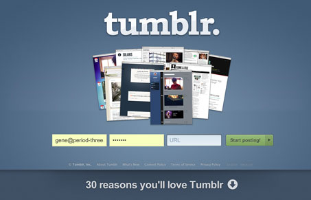
Tumblr’s website, or specifically the signup form that’s on their home page, has been something i’ve raved about in past posts and talks. I was and still is a simple success. With just three fields Tumblr has you singed up, logged in and blogging in like 5 seconds. They didn’t mess with that in this redesign and it almost feels like it’s made more simple with the form elements placed side by side instead of on top of one another.
Then there’s the “30 reasons you’ll love Tumbler” side up page content. Clicking that linked up text folds up a large page full of content designed to be scanned and taken in quickly to show off Tumblr’s many features, while leaving the signup form fixed at the top of the page. There are some things i’m not hip to, like the icons that change on mouse over them but don’t do anything when you click on them, but I can overlook that because the experience of this simple home page rework improves on what they already had.
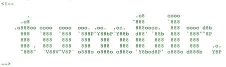
To finish it off they’ve got an ASCII style logo in their HTML! Wheee!


I can honestly say that is the first time I have ever seen the word “wheee” in a site review. Thanks Unmatchedstyle, you are my hero.
That sir. Is how we roll around here.
They’re also doing a nice little layout adjustment when you resize the browser to a smaller form factor.
Love it – wish they’d bring some updates to they’re dashboard view
I know, updating the app itself is a long time coming on Tumblr isn’t it?
The page resize thing is pretty cool… What would be the point of it though?