tracy apps design

tracyappsdesigncom

Submitted by Tracy Apps, @tapps Designer & Developer.

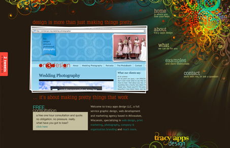
A brand new site for a newly established company. the design purposely breaks some of the commonly seen web “rules” (ie: logo at the top. limited color palate)

Really different looking design here. I don’t think i’ve seen something like the static footer that holds the logo (bottom right) and the navigation that seems to curve away from the site. I’m not sure how successful it all is either. I do like what I see visually I just wonder about using it. I will say that visually it’s hard to forget this design, there’s some a nifty illustrative quality to it that I really like.

0 Comments

Submit a Comment

Your email address will not be published. Required fields are marked *

News & Articles

The Essential Guide to Getting Started on Freelance Writing

The Essential Guide to Getting Started on Freelance Writing

Explore the lucrative and fulfilling world of freelance writing with our essential guide. Learn about specialties like blogging, social media, article, and technical writing. Build a portfolio, find work, set up your business, and discover the potential earnings. Embrace the freedom of working from home and follow tips for success in your dream career.

Securing Your Website: A DevOps Security Checklist

Securing Your Website: A DevOps Security Checklist

Learn how to secure your website with a comprehensive DevOps checklist. Dive into SSL/TLS encryption, password practices, and more. Discover the power of Content Security Policy and safeguard your online presence effectively.