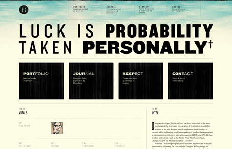
I love the large typography employed on these pages, the shapes just leap out at you then it’s all backed up with the larger blocks of nav items. The nav items are basically placed on the page twice above the fold, I’m not sure that’s totally necessary but it does look good visually. I also like the black in play with the faded yellow coloring for the background, it softens the design a good deal. Nice looking site here.


the best thing about this site is when you resize the browser. watch what happens when you get down to a mobile size (around 460px).
Oh man Adam you’re right, how the heck did I miss that about this site. That’s freaking wonderful here!