staples.com

staplescom

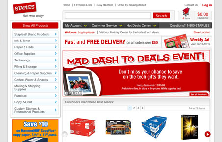
New staples website design. Vastly improved layout with a nice clean grid based design. I’m really liking the mega-drop downs too, those feel like they work really well.

1 Comment

  1. Jessica Woodrum

    I’m a little overwhelmed by some of the mega drop-downs. I think that I’d like them after working with them, but at first interaction with them, my user experience is a bit jarred.

    I really like the footer, though. It’s big and kind of grounds the design. It also helps by giving quick links to important pages.

    Reply

Submit a Comment

Your email address will not be published. Required fields are marked *

News & Articles

Website Scanning Patterns for Maximum Engagement

Website Scanning Patterns for Maximum Engagement

Discover how users visually process websites, the role of scanning patterns, content placement, and “the fold” Learn to design engaging pages with fast-to-consume content that aligns with user behavior.

Why Are Wireframes in Web Design So Important?

Why Are Wireframes in Web Design So Important?

Wireframes are the blueprint of web design, aligning goals, improving UX, and saving time. Discover why these visual structures are essential for creating intuitive, user-focused, and efficient websites.

Sign-Up: Enhancing Conversions through good UX

Sign-Up: Enhancing Conversions through good UX

Optimize your website’s sign-up process by focusing on clarity, ease, and user mindset. Clearly explain the purpose, benefits, and steps, and use social proof to build trust and drive conversions.