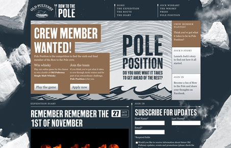
In my and Giovanni’s screen cast review we both really liked the vertical parallax effect in the background. However at a certain point we felt like it actually beings to interfere with your ability to read the text on the page. We’d love to hear your thoughts on this.
Outside of the above statement, we both really liked this website design. The illustration work is nice and we also like the colors and the branding here. The sub pages losing the background image is also a nice touch to create some differentiation between the home and sub pages. We both give it a thumbs up.


The parallax effect while scrolling is delicious
I thought that was really cool and unique too John.
Had to comment too…
Nice use of the Parallax scrolling effect of the backgrounds!
good find.
Just noticed your vimeo video reviews of sites.
Again nice job, takes the gallery to the next level.
I’ll be checking out a few of those, and subscribing to the rss feed for those.
-ty
Thanks Crssp! Really glad to hear you like them.
It’s neat, but only because it’s done with jquery. Not sure why things that were done in 1998 in flash are so highly regarded just because they don’t use flash. It’s actually silly.
I’d have to believe that someone in 1998 pulling something like this off in flash wouldn’t be able to restrain themselves to just the background parallax effect.