posterroast.com

posterroastcom

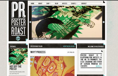
I like the blockiness of this design. The colors and textures really speak to the screen printed medium too. I also like the slight little 3D page fold elements tossed here and there. There are some areas where the type is set full justified and that doesn’t work for me. I don’t think a left justified set of text would really hurt the design any. Just my humble opinion there.

0 Comments

Submit a Comment

Your email address will not be published. Required fields are marked *

News & Articles

The Essential Guide to Getting Started on Freelance Writing

The Essential Guide to Getting Started on Freelance Writing

Explore the lucrative and fulfilling world of freelance writing with our essential guide. Learn about specialties like blogging, social media, article, and technical writing. Build a portfolio, find work, set up your business, and discover the potential earnings. Embrace the freedom of working from home and follow tips for success in your dream career.

Securing Your Website: A DevOps Security Checklist

Securing Your Website: A DevOps Security Checklist

Learn how to secure your website with a comprehensive DevOps checklist. Dive into SSL/TLS encryption, password practices, and more. Discover the power of Content Security Policy and safeguard your online presence effectively.