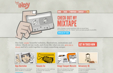
Heyindy.com pretty much rocks your socks off. The site is simple, elegant and fun. It has a nice balance of typography and art and a simple modular structure that is easy to understand. The colors are varied but muted, which works well as a backdrop to the the content artwork. And speaking of art, this site has a truckload of great stuff. These guys do it up right (not grammatically correct but, it gets the point across)! Their art is amazing and the inspiration bar on the right side of their blog is probably the best collection of vector based art I have ever seen.
So, heyindy.com is a nice mix of structure and art. It’s easy to navigate and has well established hierarchy based on scale and color. I dig.


totally agree. I’m always a sucker for illustration, so I love how heyindy.com incorporated it into the “header” section – if you can even call it that.
wonderful site.