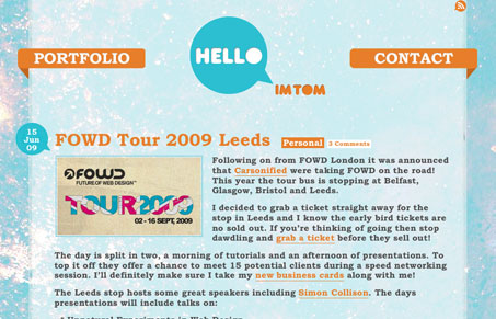
This site is very unique looking. The background really pops out at you and the texture used in it almost looks like the surface of the moon. The other details on the page all share a similar rounded feeling. The site is really just a basic blog layout, with each post having a single large picture, you have to like the simplicity. I will say that i’m not a big fan of the font that the main body copy for each post is set in. It feels way to bold and makes it hard to read, a simpler smaller looking font would probably do wonders for the readability of the page.
Glassmorphism: The Transparent Design Trend That Refuses to Fade
Glassmorphism brings transparency, depth, and light back into modern UI. Learn how this “frosted glass” design trend enhances hierarchy, focus, and atmosphere, plus how to implement it in CSS responsibly.


0 Comments