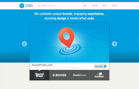
I love it when you come across a site that maximizes the creative use of their brand. In Elevate’s case, they’ve done a really thorough job of weaving in what they do and whom they do it for. Having the main portion of their home page background change out with the featured client carousel is brilliant. (They also carry it through to the Work pages.) Not only does it add a ton of visual interest, but also it demonstrates that branding is in their blood. You immediately get the sense that they’re passionate about their work and the relationships that come with it. They make great use of color and shapes throughout the site in a way that almost mimics a key or legend. I dig that. There are so many nice touches throughout the whole site but make sure to check out the contact page. Aside from labeling it “Connect” which seems most appropriate, they’ve done some snazzy work in making that form fun to fill out.
Review by: Maria Frey
@mariafrey | mariafrey.com


0 Comments