Chris Coyier’s website CSS-Tricks.com is likely already in your bookmarks, if you’re like me you check this one often to see how CSS is being pushed and experimented with daily. When he rolled out his most recent version of CSS-Tricks.com not too long ago (we reviewed the last version here) I took notice of several details. Instead of only just giving you my opinions on this website I thought I would call Chris up on Skype and talk through some of the things that he put into the redesign.
From the overall new-ness of the design down to the forum his site is so full of content that it’s much more than just a blog. There are screen casts, code snippets, blog posts, a forum and more to deal with. The undertaking of a redesign like this is a pretty big project and so I’d like to break down my favorite parts:
To start with the website is built with media queries and so can scale down width wise to fit on different screen sizes. That’s a nice touch and show’s a thoroughness that we’ve all come to expect from Chris’ work. Chris shared his desire to rework the site to be wider than the standard 1024 width website but at the same time not leave out those that have smaller screens than that, then also the smaller than that screens for mobile devices. Enter the media query, i’d say his use of this is highly successful for this case.
We discussed the color scheme of the design as well. I think I agree with Chris in the case of the colors he’s selected, being bold and different in this case, really helps blend in all the disparate ad designs and colors and ultimately makes the overall design look harmonious.
Breakdown
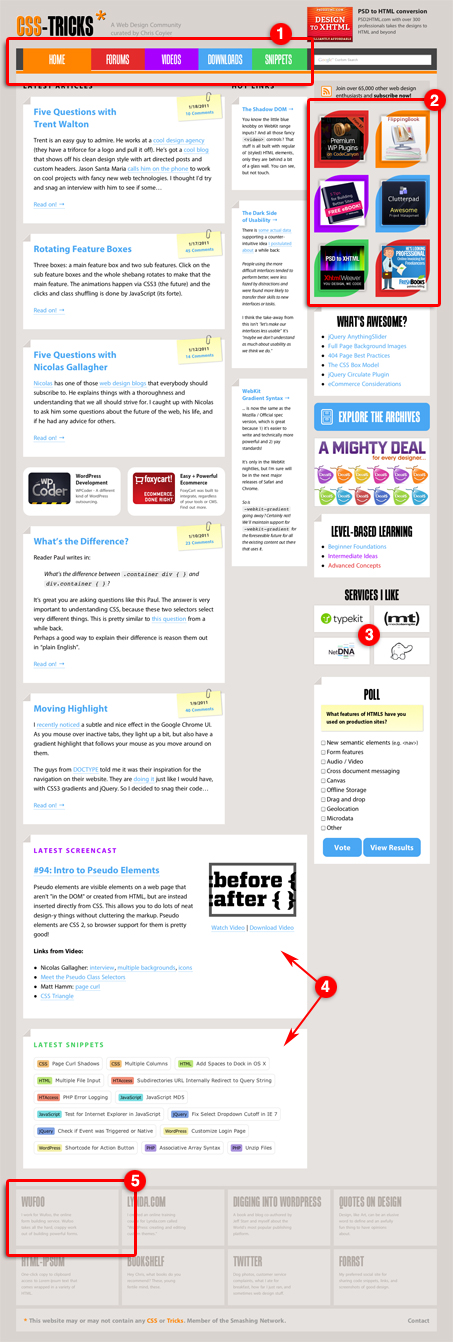
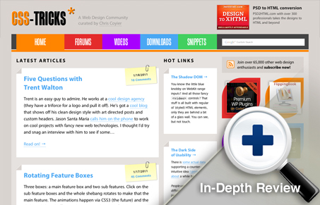
1. Main Navigation
I like the navigation design, I think the size and colors make it very obvious for the user on the page and I love how all the colors work together with the other content sections of the site. The interactions on the navigation elements are fun and in my opinion really set the tone for the rest of the website’s visual experience, in a good way. They are done with CSS transitions, it is “CSS-Tricks” after all. Chris says that the navigation is the most un-liked part of the redesign by his readers but imho it’s the best part.
2. Advertising
I love how the shape behind the sidebar ads changes as you roll over them. The shape really draws your eye toward the ads then the roll overs are fun to discover. Done with changing the border radius of the top-left and bottom-right sides of a square. It’s like most things on Chris’ site, a simple idea applied in a non-obvious way, it makes for great stuff!
3. Recommended Services
These extra services are featured in this area, but like with the ads above it they have an interesting mouse over effect with the flipping rectangle animation. It’s things like this that will keep users involved with small details of your website that might otherwise get overlooked and ignored.
4. Specialized Content
These sections house the special content of the snippets and screen casts. This content doesn’t mix too well with a regular blog post and often have longer shelf lives than traditional posts too. So they need their own space, I like this spot for them. Down under the main posts section, but more permanent feeling, especially the snippets section with the way the tagging has been color coded, etc…
5. Footer
The footer is pretty exciting, again a simple idea executed in a non-obvious way. The roll overs here are just nice when you discover them, they are all different with the icons and colors and have a really nice ‘reveal’ when you see the colors and stuff.
The real lesson we can take away from CSS-Tricks.com (aside from the literal lessons Chris gives us) is that you can take a simple concept and do some really nice conceptual interactions that are fun and memorable to your users.
About: Chris Coyier
![]() From chriscoyier.net: I create websites and help people make theirs better through writing, speaking, and working on web applications. I consider myself a lucky man. Creator of CSS-Tricks.com and Lead Hucklebucker. Master Cascader. Head Tag Closer at Wufoo.
From chriscoyier.net: I create websites and help people make theirs better through writing, speaking, and working on web applications. I consider myself a lucky man. Creator of CSS-Tricks.com and Lead Hucklebucker. Master Cascader. Head Tag Closer at Wufoo.
Follow Chris on Twitter @chriscoyier


Good review of Chris’ site. I am one of those that dislikes the nav. Just not a fan of the rainbow colors. Even with some of the new things he has added bother me, it really doesn’t matter. Chris’ content is king, and that is why I am there.
Some of the newer items feel like he did them just to say he did. But that is fine because he has the unique ability to do whatever the hell he wants in terms of using experimental stuff. It wouldn’t make sense if it didn’t, considering it’s called css-tricks!
While I prefer the last design version, I would rather see Chris doing all sorts of CSS crazy than keep the look I like better.
I didn´t liked the previous design but this is awesome.
Every day I am more confortable using it. I love the colors of the nav but the movement… I think that it´s unnecesary. Chris Coyier simply is the best and his blog is a bible of design
yes css-trick design are cool, till now still trying to make great design like that, but most important thing I learn CSS a lot from Chris Coyier, thanks
@Miguel said: “(…) Chris Coyier simply is the best and his blog is a bible of design”.
You could say CSS tricks is a great place to learn new CSS tricks. But a bible of design it is not. Design is not hover states, etc.
Personally I like the content for its front end tips and tricks, but I only read it on google reader, because the site itself is kind of hard on my eyes. Sorry, just being honest here.
To improve, you should start by changing the paragraphs’ face to a serif, so it’s easier to read, and keep the number of overall typefaces to 2 or 3 tops, and choose ones that compliment each other (currently they’re all kind of similar). Also, the colour scheme is not helping the meat of the content stand out. Everything looks the same despite being fairly well organised. The colours also don’t add anything to your branding, if anything they dilute it. The cliches also abound, like the little folded corners or the post-its with clips for the post date. There are lots of other things, but these are the most glaring.
I hope this doesn’t sound arrogant, but these are just some basic design principles which should help you develop as a designer. There’s a lot of room for improvement, and it starts with removing, not by adding.
Peace.
Loved the review, not sure the rainbow button design works for me but I do understand the desire to blend the ads in as best as possible to take away all the focus on bright ads and viewers not as focused on the content as the bright ads. Love the way you’re utilizing all the CSS-Tricks on your site. I love all your content and have learned so much from your examples and content and am constantly referring others to your site.
Great review/interview. Will have to look into your coding for the CSS-Tricks you just implemented. Not sure if you broke those tricks down for our benefit yet. Hoping so.
Thanks,
Jim Zak
I have followed CSS-Tricks since the first year it was out and have always enjoyed following the different iterations of the layout/design. This one really showcases the new and fun abilities we will be able to use once some of the browsers catch up. (Firefox does not even show some of the new features :O )
As Jeremy Carlson above: It does not matter what the design look like as long as his content continues to be so strong/relevant/cutting edge
Cheers
@CS – Always appreciate the criticism. I’m gonna respond to stuff because that’s just kinda what I do.
In print design, it’s traditional thinking that serifs help “guide the eye” to help reading easier. Sans-serifs are actually more common in design for screens, even for body type, as they (can) render more cleanly.
I think Myriad is a nice body copy font, and plenty readable especially at big 18px I put it at.
I also think the typography on the site is far from perfect. There is a lack of vertical rhythm that is just my own laziness.
What is my branding? I my opinion it’s the star, which is used sporadically throughout the site.
The colors in use are specially meant to be bright, fun, and playful. The idea is to keep the site lighthearted and to encourage people being less super-serious-face.
Feel free to let me know…
This is the (I think eighth?) generation of this site. Much of that has been an evolution of previous designs as I react to feedback, the content on the site, defining my style, and reacting to needs that come up.