contrivedigital.com

contrivedigitalcom

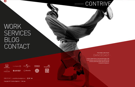
This site makes a striking first impression. The bold red and the crossing lines and angular shapes make for a dynamic look. The black and white photos work well and each ‘page’ is different and interesting. Some of the pages work better than others, however. The showcase page serves up a grid of of work and is easy to navigate. The services page separates all of its content into each compartment, making it hard for my eye to know where to land, since each bit is so spread out. One minor issue is that the main font used is often too light and small, making it hard to read. It’s also using cufon to render the fonts. While there’s nothing ‘wrong’ with this, it’s really an outdated thing to be using. The main font looks a bit like DIN, which is available from FontFont. That said, this is still an interesting and experimental site.

0 Comments

Submit a Comment

Your email address will not be published. Required fields are marked *

News & Articles

The Essential Guide to Getting Started on Freelance Writing

The Essential Guide to Getting Started on Freelance Writing

Explore the lucrative and fulfilling world of freelance writing with our essential guide. Learn about specialties like blogging, social media, article, and technical writing. Build a portfolio, find work, set up your business, and discover the potential earnings. Embrace the freedom of working from home and follow tips for success in your dream career.

Securing Your Website: A DevOps Security Checklist

Securing Your Website: A DevOps Security Checklist

Learn how to secure your website with a comprehensive DevOps checklist. Dive into SSL/TLS encryption, password practices, and more. Discover the power of Content Security Policy and safeguard your online presence effectively.