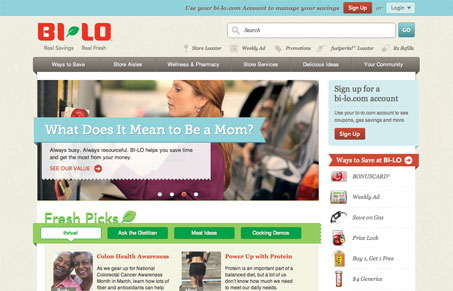
Beautiful new website for BI-LO grocery stores by the ever impressive team at e house studio. Aside from being a great example of organization and clean design it also just looks great. I love those “mega drop downs”.
There is a good deal of content on this site, and what’s great here is that you can quickly get a sense for where it all is, that’s a testament to strong Information Architecture – something these guys have come to be known for. This site isn’t flashy, it’s not going to win over the local ad-club awards boys, but from my perspective it’s a clinic in how to deliver a solid experience for a very large client.
The site is also built utilizing HTML5 tags and the ever ready jQuery. Deadly combo, wielded with precision on this website.


Thanks guys for the great video review and written comment. We are really happy with the work that was done on the project. We had a great client to work with that let us do the steps that needed to be taken beyond the ui design and development such as in-depth content strategy, usability testing, custom icons, etc. that we believe shows in the end.
Thanks again