We use Beanstalk here for our web design business and i’ve always liked Wildbit’s apps. I noticed they’d redesigned the Beanstalk website a while back and always meant to put it in the gallery. So here it is.
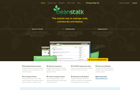
I like how the screen shots of the app are minimized next to the main tagline/copy, that’s kind of backwards from most web app sites and it really works well visually. The three main points “Version Control, Collaboration & Deployments” listed below that with icons and a line connecting all of them also really help accentuate what the product does, and tells the story of what it does well.
I particularly zeroed in on the call to action, the “Pricing & Signup” link in the top navigation and again in the green button next to the screen shots of the app. They are fairly minimized in size compared to rest of the site, but they stand out well. Just using slight difference in size and color they really draw attention.


0 Comments