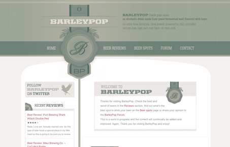
Although this isn’t the first of its kind, a beer-reviewing site, I’m sure there is room for another well designed site like this. It has a pleasing mono-chromatic color palette with art that evokes beer labels without being too literal or garish. It’s just the right balance.
As with all things well designed there are details that can take a site from good to great. One thing that could help this site is more attention paid to spacing and type hierarchy. There are big variations in type size, weight, and sometimes followed by big chunks of white space, often around images. I get the impression this was designed with minimal images, or without regard to variance in image sizes, and as a result there are some weird wrapping issues.


0 Comments