alanpower.net

alanpowernet

Submitted by: Al Power
Role: Designer & Developer

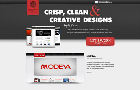
I guess Alan is fortunate to have the last name ‘Power’. It makes his logo almost design itself. His site is a one page site consisting of a list of work and a contact form. For most people, this is really all you need. Just let your work do the talking. The layout is straightforward. The type choices aren’t so bad, but the big ampersand is overpowering, and doesn’t really go with the slab-serif or the heavy sans-serif in my opinion. I count five different fonts in the header alone. This isn’t necessarily a bad thing, but showing some restraint in fonts can help with cohesion in a type driven layout. Scrolling down the page reveals a simple and effective layout with easy links to the actual sites. All in all, this is a good site that effectively shows off Al’s work.

1 Comment

  1. Lev Volodko

    Nice site.

    Reply

Submit a Comment

Your email address will not be published. Required fields are marked *

News & Articles

The Essential Guide to Getting Started on Freelance Writing

The Essential Guide to Getting Started on Freelance Writing

Explore the lucrative and fulfilling world of freelance writing with our essential guide. Learn about specialties like blogging, social media, article, and technical writing. Build a portfolio, find work, set up your business, and discover the potential earnings. Embrace the freedom of working from home and follow tips for success in your dream career.

Securing Your Website: A DevOps Security Checklist

Securing Your Website: A DevOps Security Checklist

Learn how to secure your website with a comprehensive DevOps checklist. Dive into SSL/TLS encryption, password practices, and more. Discover the power of Content Security Policy and safeguard your online presence effectively.