Simple yet powerful visuals and text make this website stand out to me. I love the headline and I love the typography. The way the work samples are presented are visually bold and lead you down the page scrolling for more.
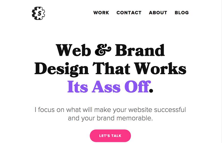
Simple yet powerful visuals and text make this website stand out to me. I love the headline and I love the typography. The way the work samples are presented are visually bold and lead you down the page scrolling for more.
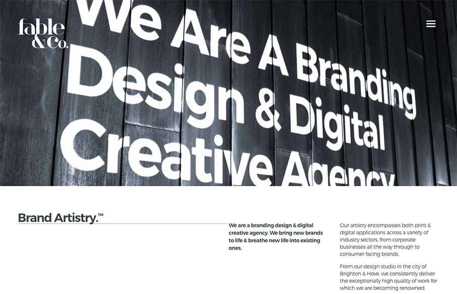
I really love the big images used on the home page for the work samples, I also love the way the images slightly zoom in as youm mouse over them too. Overall the design has a such a great vibe and comes off feeling very cool. There's a rather interesting visual moment...
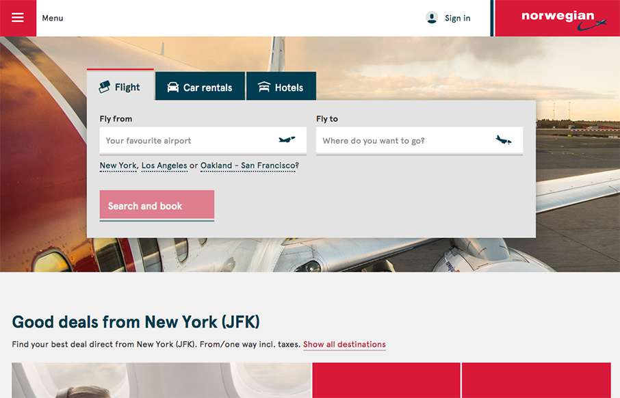
Our opinion of restaurant sites is usually like our opinion of airline sites - they generally stink. That's why it's refreshing to see Norwegian Airlines' site. It's clean, and simple, and functional. They've taken a lot of the business out of the home page, and put...
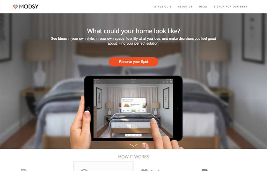
The product looks pretty stellar and the website matches it quite well. I dig the simplified lines and approach to the layout. The slider being place down lower on the page scroll is well placed and timed too.
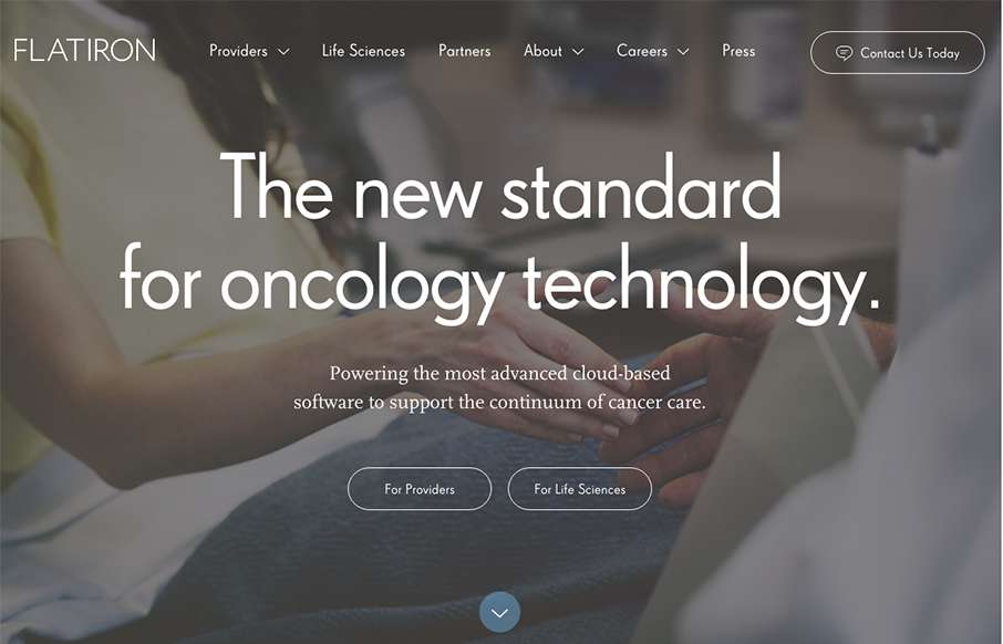
Very nicely done business oriented website here. It's enterprise-y in all it's glory but also very slick and not busted. I love the way the main nav changes color to indicate state on the page. Then when you hit the section as you scroll that walks you through the...
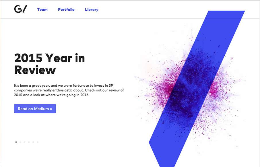
Another stunning version of the Google Ventures website. I love the slight parallax on the main imagery paired with the overall minimalism. The new logo is quite nice as well.
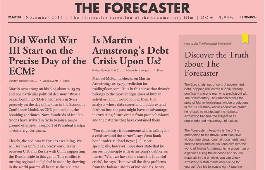
Have you ever watched a movie (documentary or historicalish fiction), and wished you had some extra insight into the background of the film? Well, for The Forecaster (see info below - and, well the website attached), they've done just that. It has a Financial Times...
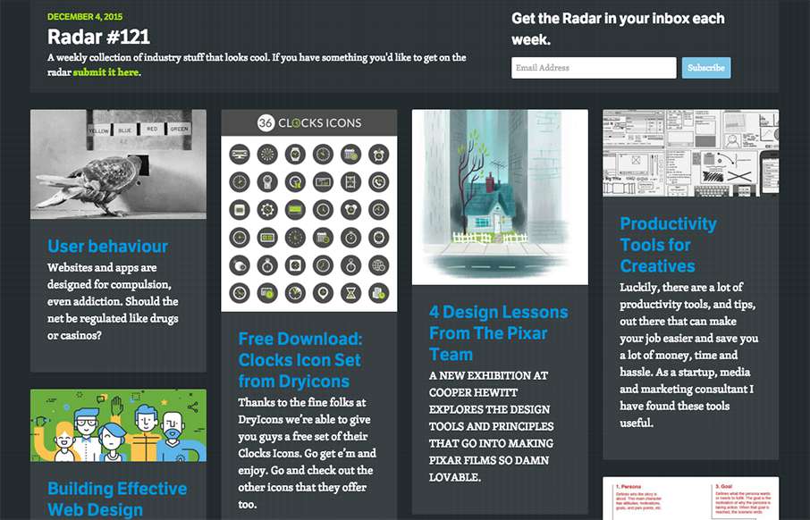
Each week, we do a round up of curated "stuff from the interwebs" that we call Radar. In this week's 121st Radar: User behaviour Websites and apps are designed for compulsion, even addiction. Should the net be regulated like drugs or casinos? Free Download: Clocks...
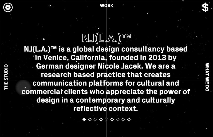
um... wut? Crazy, but cool site from Nicole Jacek out of California - be careful clicking on the circle on the top left with your headphones on... or off. Enjoy some experimental stuff!
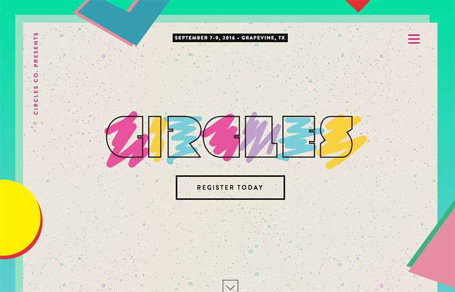
Arrrrgh - it's killing me - I've been trying to figure out / remember for the past two days what album cover that the Circles Conference is pulling their hero image from... at least I think it's an album cover - I'm doubting myself more and more on this over the week...
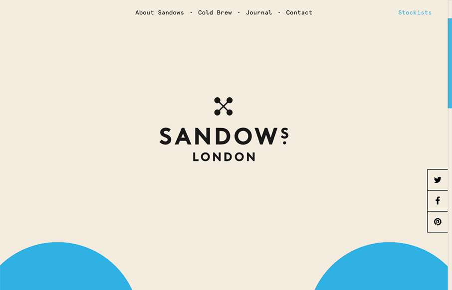
Super cool scrolling image in the background of the site, turns out it's the logo too. Pretty solid. I love the minimal yet engrossing vibe of the site. If only I could try this coldbrew!
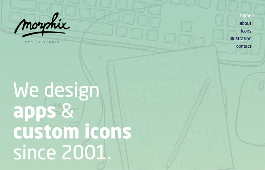
Pretty nice soft yet solid vibe for the Morphix Studios website. I love the illustration work across the site and the simple layout details make me smile. From the Designer: Website of a design studio, based in Slovenia, Europe. We're specialized in product design...
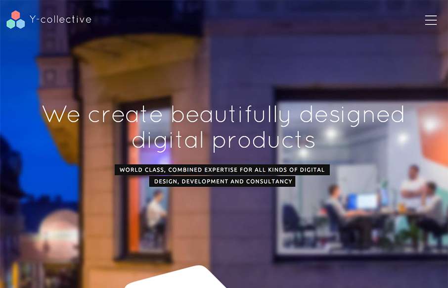
Really cool layout and detail work for the Y Collective website. I love the honeycomb stuff and the load in animations on the different sections of the home page. Bravo on this design guys! From the Designer: When I have created logo, I decided that I will use the...
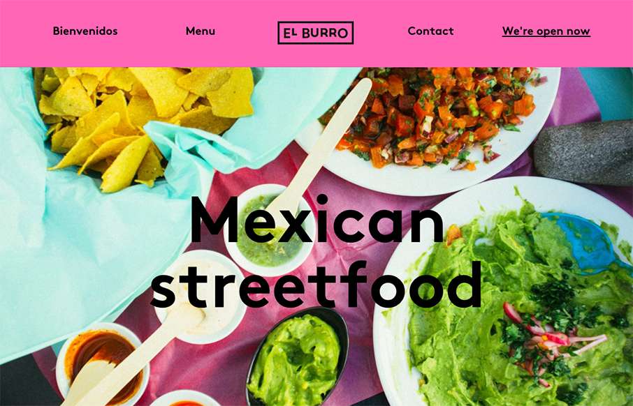
Tacos in Oslo.. yep. When I lived in Australia, getting Mexican food was always hit or miss - so hope El Burro's food is as good as their website. BTW - this is a great one-pager for a restaurant (which we've said before... restaurant websites usually stink). I'm not...
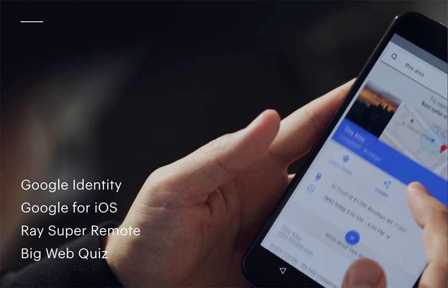
Awesome site from This Also out of Brooklyn. Great home page with video background - great use of navigation that is hamburger, but it's not - and great way of each page always leading back to the home page, but it's also the footer, that's the home page... cool.
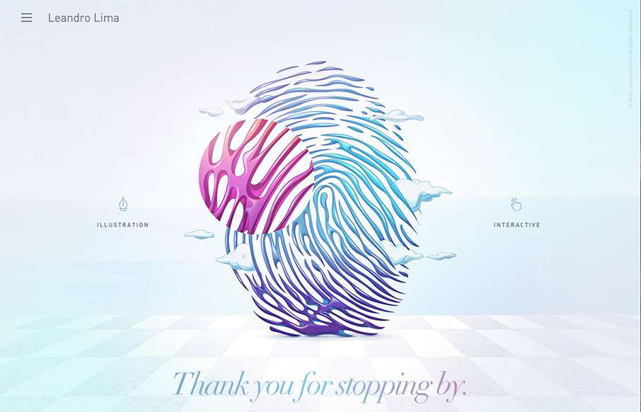
Leandro Lima, out of Barcelona has some great work highlighted here - especially the illustration side of the site. I also like the look and motion of the hamburger drawer on the left.
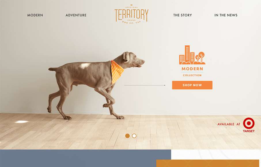
Love the texture that's woven into this site - both fore- and background, for Original Territory Brand Dog Co out of White Plains, NY. Cool little icon work on the nav too.
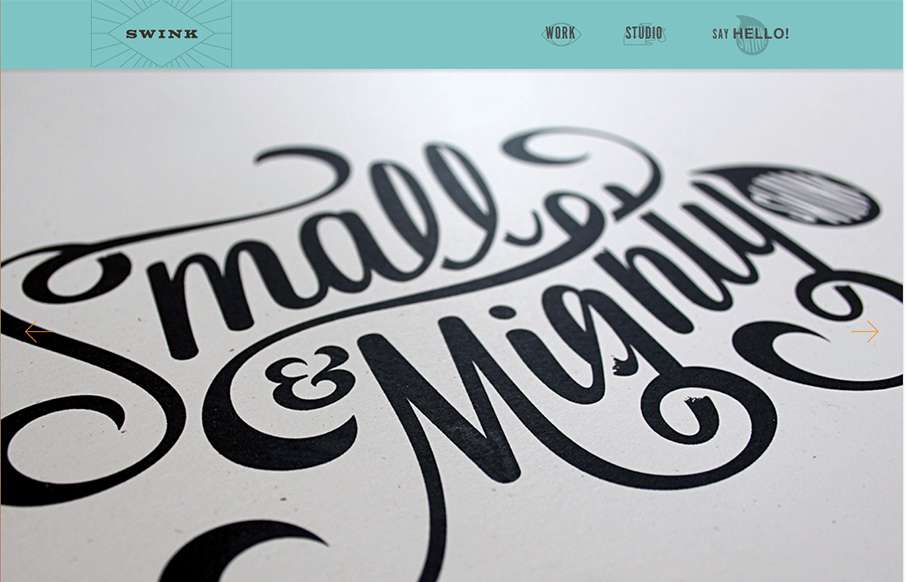
This studio / agency site for Swink out of Wisconsin is pretty sweet. We're rebuilding our client services site - and this is great inspiration (we won't steal, we promise). Love the font work and letterpress style of the site.
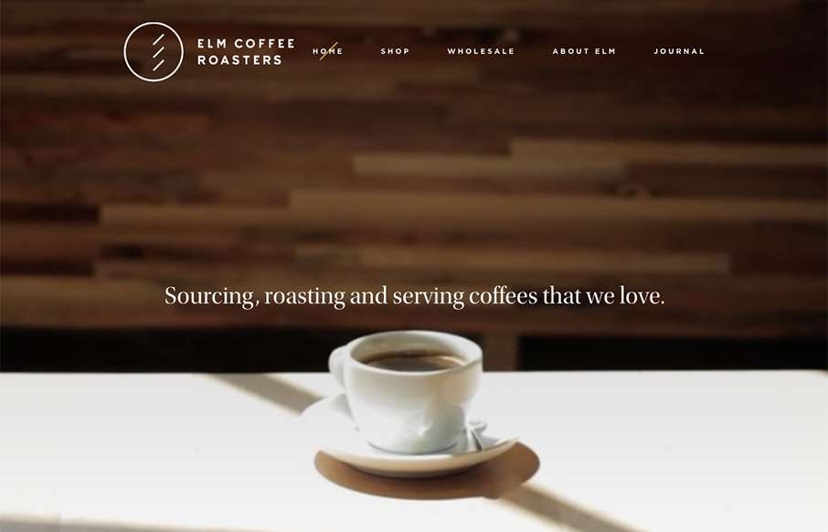
As I was setting up the review for Elm Coffee Roasters out of Seattle - I found myself stopping, and going to get coffee at least twice... I guess the marketing is working. Great design - clean and simple, with video background on top - excellent!
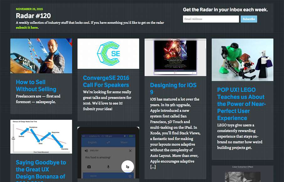
Each week, we do a round up of curated "stuff from the interwebs" that we call Radar. In this week's 120th Radar: How to Sell Without Selling Freelancers are — first and foremost — salespeople. ConvergeSE 2016 Call For Speakers We’re looking for some really great...
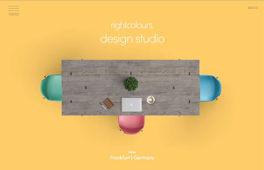
Quick, clean agency site from rightcolours out of Frankfurt, Germany. I wish it was responsive, but I like the big images on each page.
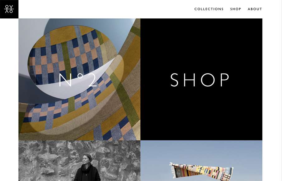
I love the speed of the Oyyo website out of Stockholm. The transitions are quick, and the site is neat and simple.
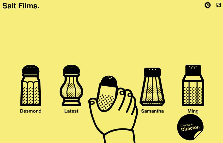
Very unique way to interact with the website, i'm 50/50 on liking it or what. I do think it's very memorable and probably converts clients very well.
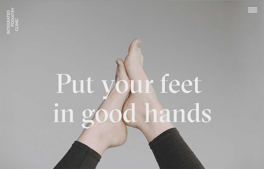
Super rad website for a Podiatry clinic. You just don't see this type of design being brought to client's like these. Superb work on making something mundane feel really hip and new.
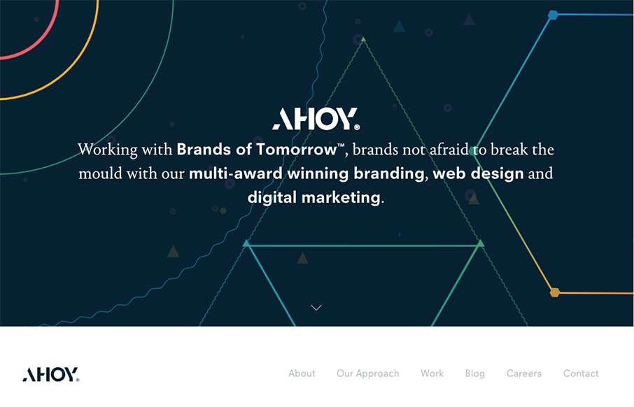
I love the dark field with the geometric shapes art. Pretty snazzy stuff. I really dig the way the content is blocked out on the home page too. I've never seen something like they're doing with the "call our account director" content block before either, that seems...
If you like lavish visuals and solid yet simple typography then the DK site is for you. It's chock full of custom videography and really is a clinic for us all to see how to use it within a web page. Solid work and really solid website for this digital firm. (This is...
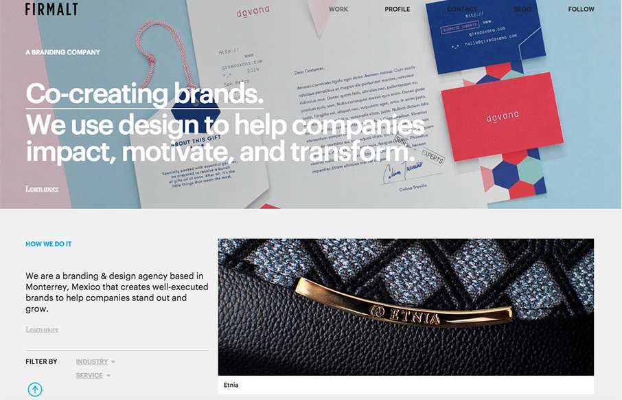
Nice grid based layout for Firmalt. I like the Masonry like treatment of the main image blocks as you scroll down the page and shift screen sizes. Nice solid simple layout always wins!
Holy hell I love this site design. The way the main hero area/image merges into the main site is brilliantly done. Then the rest of the layout is invigorating. Do me a favor, just spend some time on this site and tell me what you think!
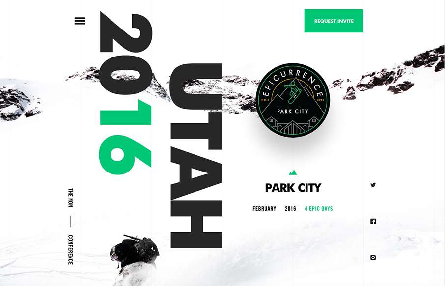
Holy cow I love this. I love the interactions and the pieces that move around as you scroll. It feels quick to respond and looks pretty dang unique too. Definitely a memorable site design. Also, I want to go. 🙂
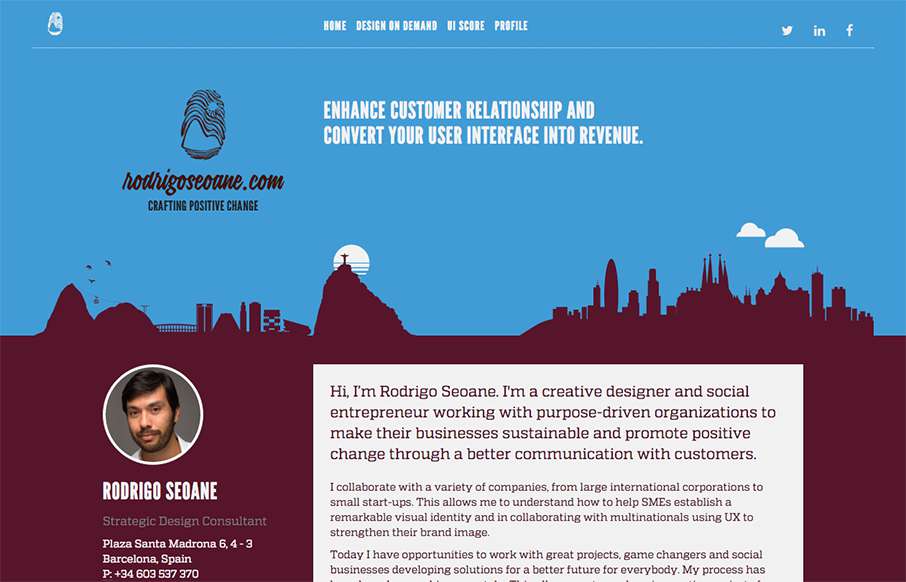
At first this site design looks fairly classic in its layout. I dig the smaller changes to it in that respect. Some good looking graphic devices to help communicate what he does is smart. I also dig the colors. From the Designer: Hi, I’m Rodrigo Seoane. I'm a creative...
