What is “microcopy” and why is it so important? Let’s start off with a really quick definition: The small bits of text/copy that help instruct and alleviate the concerns of your users. Pretty straight forward I think. It’s really more about detail work, it can make or break your website’s experience, it can also make bank or break the bank. I’ll have examples of that later.
Inspiration
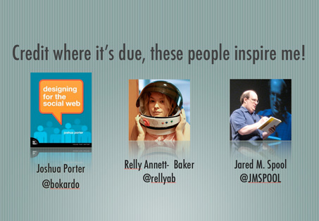
First though I have to give credit where it’s due. People like Joshua Porter (@bokardo), Relly Annett-Baker (@rellyab) and Jared M. Spool (@JMSPOOL) all talk about the subject of microcopy a lot. I’ve learned a tremendous amount from these people and you should follow them and learn from them. Without them a lot this subject matter doesn’t get talked about.
Context
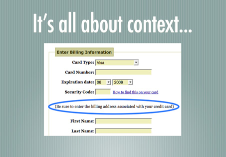
Here’s a story about context: Joshua porter says in his post on microcopy here, that: “Ironically, the smallest bits of copy, microcopy, can have the biggest impact.” This is stated inline with a story about one of the first transaction forms he created. Customers were entering in their addresses but he kept getting credit card fail messages. After investigation it turns out they were not entering info that matched their credit card billing address causing the transaction to be declined. After a quick addition of a simple sentence “Be sure to enter the billing address associated with your credit card” the problem went away. To me this is a great story of the power to clarify what’s going on with a user’s data and the form.
$300 million button

Here’s a great story by Jared Spool @ User Interface Engineering about how utilization of microcopy (and a well placed change) can effect business in a HUGE way. He doesn’t name names, but the scenario is a typical e-commerce scenario. The checkout process. The “Register Now” button was placed before the final checkout (like on most shopping sites.) Customers didn’t want to be forced to become “members” of the website to complete their purchases resulting in a high level of shopping card abandonment. In other words they wanted to buy the product(s) but they didn’t want to be friends… Even though the customer didn’t really need to do this, they could actually bypass the signup process and submit their order, it just wasn’t clear enough. After some testing and study they changed “Register” to “Continue” and added some copy explaining how the user didn’t need to “become a member” to make a purchase. Really, just simple HTML changes, no functional development needed. This increased conversions by something like 45%, it made the client an extra $300,000,000 the first year after.
Test & Refine – A/B Testing
I really can’t say enough about the work 37signals does in regards to microcopy and specifically A/B testing. They share what they learn on their blog signal vs. noise, like when they write about page headline tests or their sign up form design changes or when they reworked their site design for Basecamp. Looking at how customers use your website, studying the conversion rate and then testing small incremental changes is a great way to approach design in general. But largely these changes and additions are going to come in the form of microcopy. Small chunks of copy or text that help lead customers to your desired goals. I like to study from the best and 37signals are some of the best on this subject. Like they say in their book Getting Real “Copywriting is Interface Design”. Here’s an excerpt that I think really drives this home:
Do you label a button Submit or Save or Update or New or Create? That’s copywriting. Do you write three sentences or five? Do you explain with general examples or with details? Do you label content New or Updated or Recently Updated or Modified? Is it There are new messages: 5 or There are 5 new messages or is it 5 or five or messages or posts? All of this matters.
What’s a post without examples in the wild?
Here are some examples of websites that have really great microcopy we can learn from.
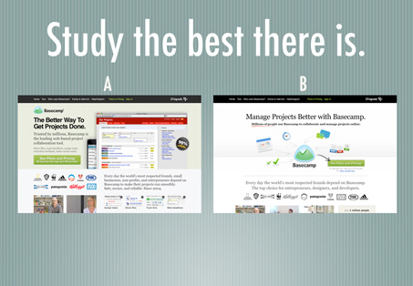
37signals/Basecamp
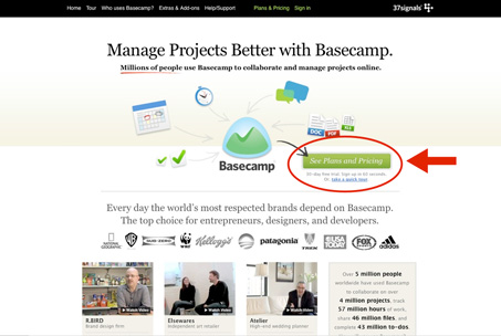
Again, these guys are the best at this stuff. Look at the page’s main call to action. It’s “see plans and pricing”, not just “sign up”. They have come to know that this works much better through testing and analysis, their customers want to weight their options before signing up for a product and they knowingly feed that to them. It’s counter-intuitive right? You’d think that removing steps in the conversion funnel would be the smartest thing you could do. But it’s a great testament to studying your site’s analytics and learning as much as you can about your customer’s behavior and adjusting things to match.
Zendesk
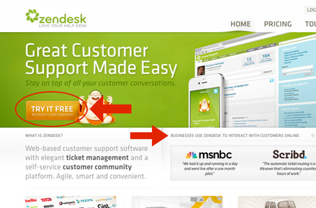
The copy on the Zendesk signup button is “try it free, no credit card required” that’s smart. Informing a potential customer that you can try the software without giving up your credit card info lowers the level of trust they need to put into your business. You need to trust a website/business a good deal before you give over your credit card number, right? The page also has other strategically placed copy elements that deliver trust building statements.
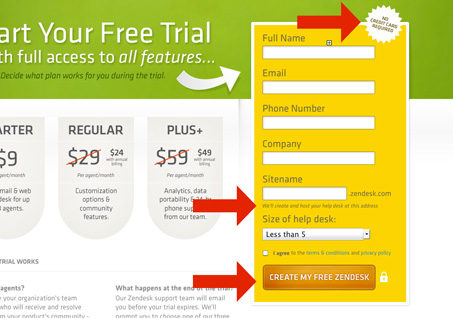
They also hammer home this notion that there really is not commitment to try the software out. I’m wiling to bet that Zendesk knows they have a higher likely hood of a user becoming a paying customer once they’ve gotten a chance to try the app. They make sure you realize this with the copy in the top of the signup form and again in the submit button itself, being labeled “create my free zendesk”. This forma also has some really great examples of explanatory microcopy under complex form fields. Like the sitename field, explaining both what the field is used for and how you will use the link after you’re done completing the form.
Tumblr
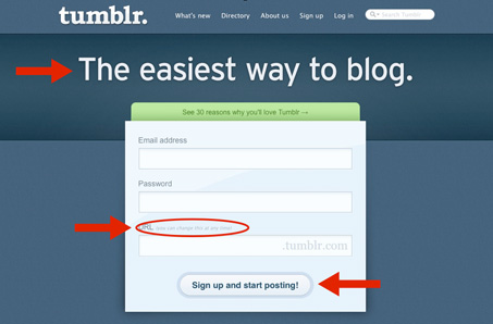
This is the previous version of Tumblr’s home page. They’ve changed it quite a bit now, but I think this design is still one of the better signup forms to have been on the web. It’s four quick steps in one form. Give them an email address and a password. Then give them a name to use for the link to your Tumblr account, they even show you how this will get used by explanation and also by putting .tumblr in the field itself. Then the submit button is labeled “sign up and start posting”. That tells you that the form is going to be submitted and the next step after that is you using your new blog. Very clever.
Virb
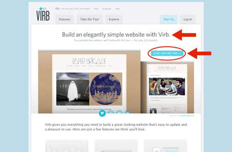
I think the Virb website design is one of the best examples of having clear and concise copy that i’ve seen in a while. The headlines on each page down to the call to action buttons are very well worded and executed. Really, go through that site with a fine toothed comb and learn from it. I did a fairly in-depth site review of virb.com a while back too.
Zappos
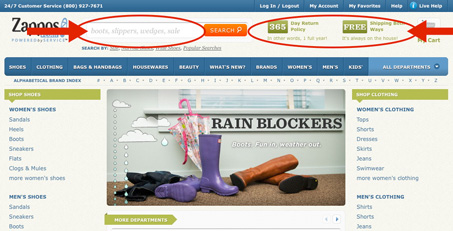
The new(ish) design of Zappos by Happy Cogg is chock full of great examples of solid microcopy. The clearest example on this site for me is the search box. They have sample text in the search box that helps inform you of how to use the feature as well as what types of items you can find on the site. Where typically this type of feature will just have “search the site” in it or something.
Twitter Chirp Conference
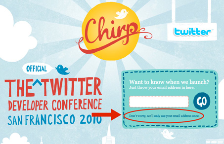
I saved a screen shot of the Chirp website – the official Twitter Conference from last year. So it’s not live anymore but I love this copy under the email form field. It states “Don’t worry we will only use your email address once” now that’s a strong statement and promise to make. It’s also very reassuring as you enter your information. Telling a visitor how the info is going to be used is a good thing, you always need to give people context.
Summary & Basic Rules
Microcopy is an extremely important component to website design. It can enhance the user’s experience and in most cases improve conversions. Here is a short list of some basic rules to live by when reviewing copy on your next website job (i’ve noted who said or inspired the rule as well.)
- Plan out what you want to say – Relly Annet-Baker
- Users want reassurance – Joshua Porter
- “When in doubt, spell it out” – Jeremy Keith
- Practice Defensive Design/Be prepared to help – Jason Fried
- Users need context – Joshua Porter
- Never, EVER use jargon – Jared Spool
These aren’t definitive by any stretch. Maybe you can help me build my list out more by adding one in the form of a comment below. At any rate, hopefully you’ve been inspired enough to review the microcopy on your website and improve the conversions or retention rates there.


thank you for putting this up, I am a 20 year old student studying applied computer technology. I recently developed an interest for universal design and user experiences and i love every minute of it! thank you for the links and the article in general!
Have a good day 🙂
This is a great overview on microcopy but would benefit from a proof reading pass, as the glitches are distracting. The content, gratefully, doesn’t let down, though. Thanks for this!
I like the inclusion of who you’ve learned from on this topic, especially the twitter links. It instantly gave the article credibility to me. Do you regularly use this type of format when posting? I thinking I may just add more “Who I’ve Learned From” paragraph in my posts. Thanks for the inspiration-inspiration!