joppdesign.com

joppdesigncom

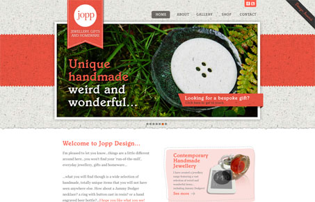
Pretty typical design formula at work here, large image, super good looking textures and other little details that tie it all together. The textures and organic feel really plays well with the site’s hand made products it’s selling.

As good looking as this design is, it’s utilizing something that i’d like to bring up. Those small circles under the big images in the slideshow. I’ve seen similar design elements a lot across new(ish) websites. I think they’re just a bit too small and almost unusable. What do you guys think of them?

1 Comment

  1. Jeff Bridgforth

    I think you bring up a good point about the slider dot navigation. They need to be bigger and have better targeting.

    Reply

Submit a Comment

Your email address will not be published. Required fields are marked *

News & Articles

The Essential Guide to Getting Started on Freelance Writing

The Essential Guide to Getting Started on Freelance Writing

Explore the lucrative and fulfilling world of freelance writing with our essential guide. Learn about specialties like blogging, social media, article, and technical writing. Build a portfolio, find work, set up your business, and discover the potential earnings. Embrace the freedom of working from home and follow tips for success in your dream career.

Securing Your Website: A DevOps Security Checklist

Securing Your Website: A DevOps Security Checklist

Learn how to secure your website with a comprehensive DevOps checklist. Dive into SSL/TLS encryption, password practices, and more. Discover the power of Content Security Policy and safeguard your online presence effectively.