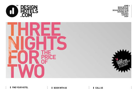
I love the clean, black and white feel of this site and having the images be the only real color on the page. I like the visual rhythm in the layout and elements as you scroll down the page, I think the navigation in the top right is kind of small for it to be stacked and so many letters like it is, the words just run together and are hard to scan. I also think that while the almost totally alien shapes of the form elements are really cool looking they wind up being confusing and make me really have to think about the form too much. Overall this site has a really nice vibe to it.
The Essential Guide to Getting Started on Freelance Writing
Explore the lucrative and fulfilling world of freelance writing with our essential guide. Learn about specialties like blogging, social media, article, and technical writing. Build a portfolio, find work, set up your business, and discover the potential earnings. Embrace the freedom of working from home and follow tips for success in your dream career.


0 Comments